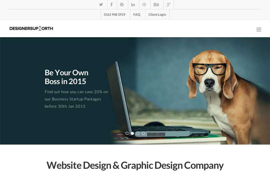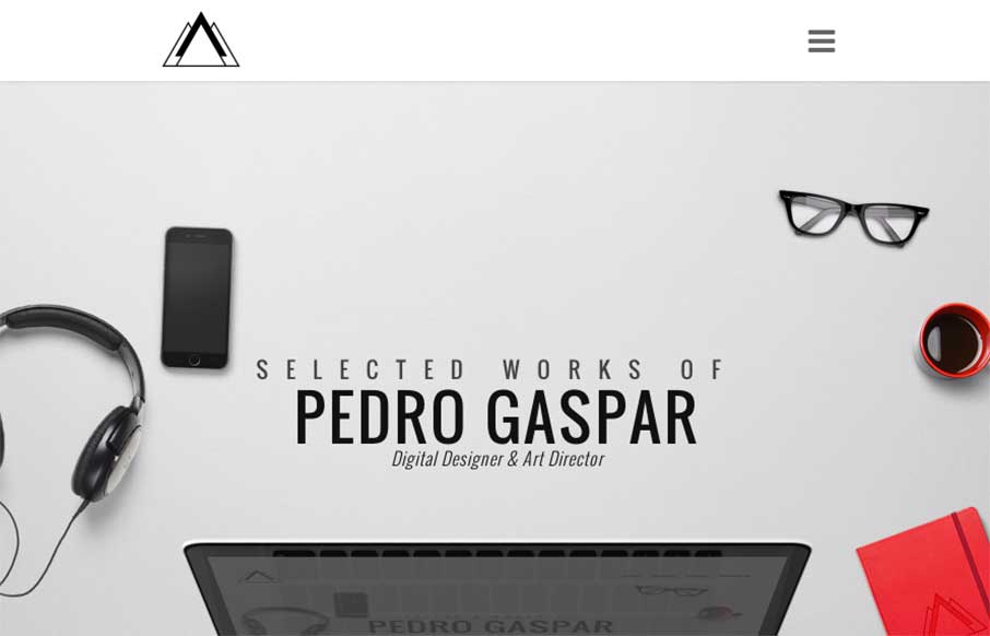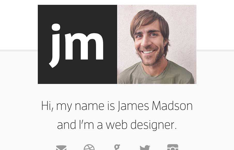
Nice portfolio site from Vito Salvatore out of London. Love the big images and especially love the iconography on the "About Me" section - kind of wish there was more. Submitted and reviewed before in 2012... @vitosalvatore
Gyroscope
Gyroscope is an app that I definitely want for my personal life (to track absolutely everything I do) - but their website (out of San Francisco) is pretty good on its own too. Think the 3d breakapart / breakout .js that some developers are using is pretty cool (used...
SuperFriendly
SuperFriendly out of Philadelphia is Dan Mall's (@danielmall) group - good people - great designers (great people too, who am I kidding). First thing I noticed was that the site renders left to right instead of top to bottom. Love how the site is super-simple - big...
Cihad Turhan
Some unique portfolio / dev work from Cihad Turhan out of Turkey. In his mobile version of the site, he says that the entire site is really one big .js file (that you can download). Love the Works section (and the 3D Works themselves). The whole site is a cool mix...
Kristof Van Espen
Really likeBelgium's Kristof Van Espen's work - one his portfolio site, and especially the client work - and the details he provides on it. Pretty good, clean and simple UIs and what looks to be good UX too. Was listening to a podcast on hiring designers - and the...
Two Times Elliott
Good start to the week with Two Times Elliott out of London. Like the mixing up of the different client work images as you go down the page. I'm a little hesitant on the 2 x's that are on the page that you just seem to click on to make them disappear - but once I got...
FontShop
We wanted to show you FontShop today - kind of a hybrid Gallery post / Radar-like resource, by Monotype. Like the different feel of the site based on the colors and the general layout - and actually, you can change the theme color (once you get to the detail pages)....
Radar #101
In this week's 101st Radar: The 2016 U.S. Presidential Candidates’ Logos, Ranked DRUNK USER TESTING Apple: UI Design Do’s and Don’ts How to Integrate SEO Elements to Move Beyond Responsive Creating Realistic Text with CSS An Inside Look at Facebook’s Approach to...
Giovanni Ghirardi
Giovanni Ghirardi portfolio site, out of Veriona, Italy, has some cool, avant garde stylings. Love how the honeycomb selfie is used with the tilted rectangle to give some real texture above the fold. Also like the hamburger drawer that comes down from the top. ...
Neutron Creative
Yes - I was the one that approved the Neutron Creative site out of Raleigh, NC. Some of you may ask "why?" - because it's a big picture and some text. The reason: I think with some agency sites, we get too wrapped up in trying to show off every trick and new thingy in...
Dice Sales
This is a solid and quick portfolio site from Dice Sales out of Christchurch, NZ. I like the integration of the background photography to the Recent Works section - he's a designer and photographer, so cool to show off both types of work. I think I also like the fact...
Big Drop Inc
Big Drop, out of New York - their biggest strength on the site is the eye popping photography of real things, and how they stand out on the page. Also really like the "Request a Quote" banner (top right) and the surprise movement you get with it. @bigdropinc
LSU
Like the look of the new LSU (Louisiana State University) website. Not wild about the colors... because I'm a U of South Carolina fan... so discount what I just said - the those are school colors, and look good for the site 🙂 Think it's interesting how it starts to...
Partners for Our Children
Partners for Our Children is one of those sites that has great purpose, yet may not be seen as 'cool'. Being in public service or government related areas sometimes makes organizations think they are alleviated from the 'burden' of good design, but we have seen many...
Grimm Brothers Brew House
I love just about everything on this website. I luuuurve the illustration work for the bottle labels. On the site itself I really dig the simple layout and colors, I especially like the fly out illustrations as you scroll down too. Now, if I could only try one of...
NY.gov
Finally - really good state government website for New York (I hear RFPs being typed out for other states as you read... well we can dream right?) Great organization and really visually established sections. I'm curious about the billboard, cardish design slider -...
Quotery
I'm a quote person - have them delivered daily to my interweb mail portal. The Quotarty looks pretty fun - looks like a very updated and organized quote site, compared to the normal, spammy, 1996 quote sites that, well have been around since 1996 (yes there are ads on...
The Nation
We've seen a lot of "newspaper / magazine" type site launches this year - and cool to see America's oldest weekly magazine do the same. Like the top story categories at the top of the page (think they change as big issues do). Really like the feel and flow of the main...
My Car Does What
Pretty cool site from the National Safety Council, called My Car Does What?: "MyCarDoesWhat.org is a national campaign to help educate drivers on new vehicle safety technologies designed to help prevent crashes. These technologies range from increasing the stability...
Super Top Secret
Dang. Enough said. @wearetopsecret
Radar #100
In this week's 100th Radar (yay us): Safari is the new IE What’s Different About User Experience Design for the Internet of Things? Stop Sprinkling Emotion, Start Creating Magic and Meaning Market - Best Tools for Everyone Style Guides Every Startup Should See in the...
Studio D
Really like this Studio D Photographers site out of Canada. A lot of moving parts through out the site and the blog - and I think it's playing off of a newer color trend (red, black, off-white so we can start to get away from teal and magenta..). Very cool to see that...
UNIITI
We've reviewed Uniiti's work out of France before - this looks like their recommendation app for restaurants and other services. Apparently the footer landscape image changed. Last night it was a dark sky with a rocket ship and this morning it's a bright day near the...
Helen V. Holmes
Designer Helen Holmes' site is a little different than most portfolios - and from the content on the site - I'm guessing Helen Holmes is too - in this world - that's a good thing! The site is light, and in parts asymmetrical, and just generally has a cool vibe....
Fighting Illini
Love to see sports sites being redesigned over the past couple of years - like this one for the Fighting Illini, in, well, Illini country. It's device sensitive, and looks big and bold on both desktop and mobile. I'm not a big fan of sticky headers with sticky footers...
Axwell Ingrosso
Ok - I don't know who Axwell and Ingrosso are (musicians out of Sweden who play every Wednesday in Ibiza) - but my girls liked their video and music when I played it for them this morning (good message btw). Their website, designed by @kaleidco, is pretty bold -...
Slick Design
Love the opening and closing imagery for Slick Design out of Perth - the movement on the page is pretty cool too (would actually like to see more of it all the way through). From the Designer: This is a beautiful, sleek website that reflects the client's brand....
Jekyll
I'm not always a huge fan of super dark websites like these, but in this case there are some pretty great parts. I like the gold mixed in with the dark vibe. I like the second section, under the hero/video area a great deal. I really like how it loads in. I'm not a...
Adrian Balkwill
Cool portfolio site from Adrian Balkwill out of Ontario - like his work and his call to action at the bottom of the work pages. (also - love the Mario favicon) From the Designer: I have been working on this site and rather like it and I hope you do too. Submitted by:...
Clínica Good Hope
Really cool design for the Clínica Good Hope (out of Peru) - especially for a hospital. A lot of flat icon and illustration work here - and interesting points of navigation/sub-nav through out. It's mobile friendly too - out pacing many hospitals here in the US. From...