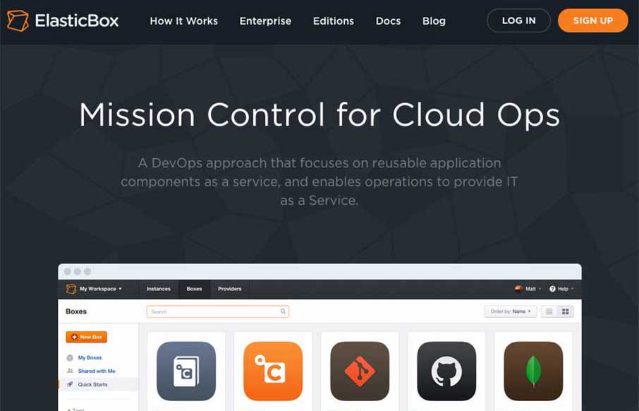
Your App Product Page is broken. You only have some icons, copy, and an image of someone staring at their smartphone with a happy smile….
What you haven’t done is to take your prospective client / user, and given them a clear path that explicitly states: This our app, this is what it does, this is how it helps you. You may have told them that, but if you take the option like ElasticBox, you could actually show them that. So if a picture is worth a thousand words, then pictures being animated to drive a customer to make a more informed decision is worth, what, a thousand dollars or more? The animation on ElasticBox does this – it’s smart, clean, linear, and still has good fallback for mobile and old browsers.
Now go, and fix your App Product Page (not you ElasticBox, you nailed it).


0 Comments