by Aaron Griswold | Feb 17, 2015 | Gallery
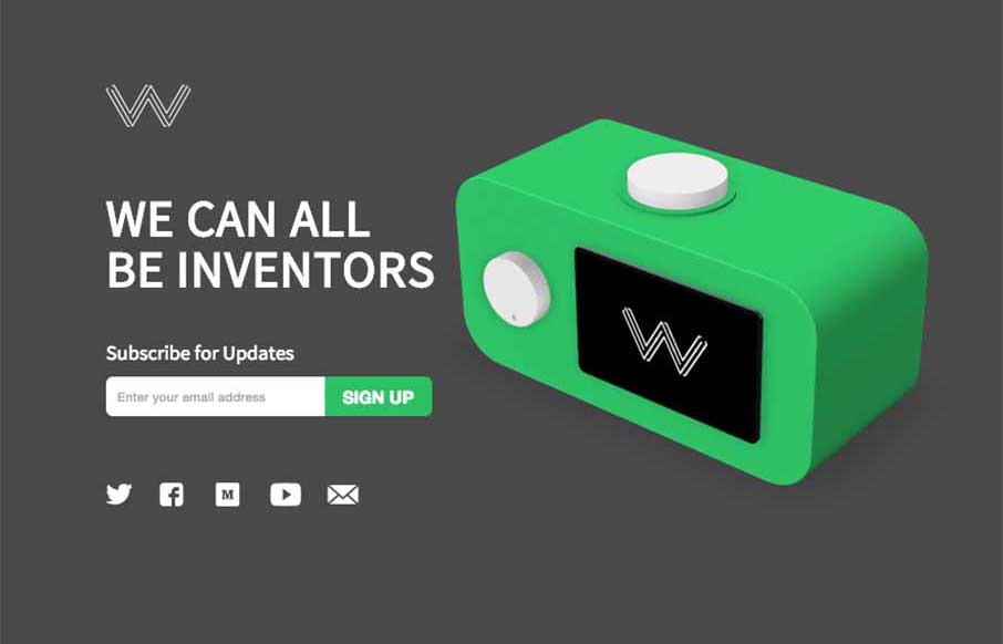
Good site and great idea from Wattage.io out of Toronto. Like the integration of the video demos to give you a feel for how the app really works – this is a case where showing your app on your one pager is actually a good thing. Simple, clean, and useful –...

by Aaron Griswold | Jan 26, 2015 | Gallery, Portfolio
Good and “quick” portfolio site from James Madson from Arizona. Again, like the Home page used as the navigation to the portfolio part. Then a simple “left/right” to move between Work detail pages, and his logo to get back to the home page. I...
by Aaron Griswold | Jan 26, 2015 | Gallery
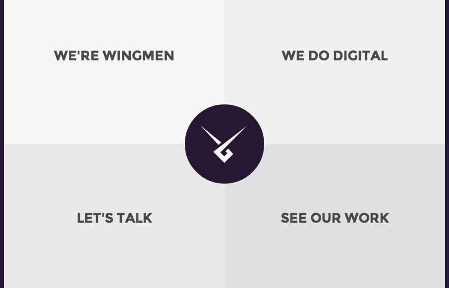
I’m really starting to get into sites that use their home page as their main navigation (maybe it’s because we did that with our new ConvergeSE site). I like Wingmen’s site (out of Helsinki, Finland) because it’s simple, direct, uses that home...
by Aaron Griswold | Jan 23, 2015 | Education, Gallery
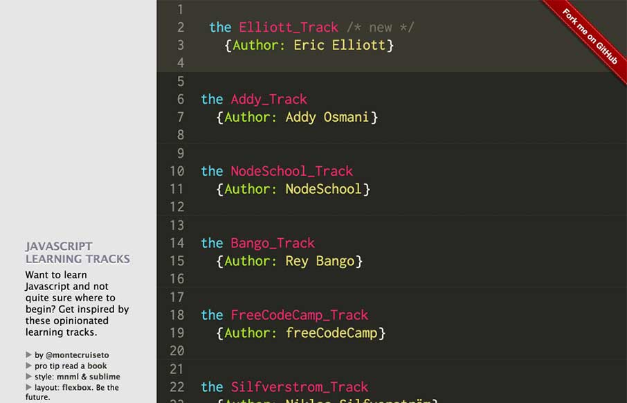
So we’re going a little different this morning. The look of the site is probably familiar to you if you stare at Sublime Text for 8 hours a day. Yes – a pretty simple site. But I like that Samir has given reference to what he uses and his inspiration. What...

by Aaron Griswold | Jan 16, 2015 | Gallery, Sports/Recreation
We admit it – sometimes we don’t just review sites for their aesthetic beauty – sometimes we review sites that are submitted because we can see there is love behind it. The LastWonATrophy site by Digital Zoo out of the UK looks like cool and fun side...