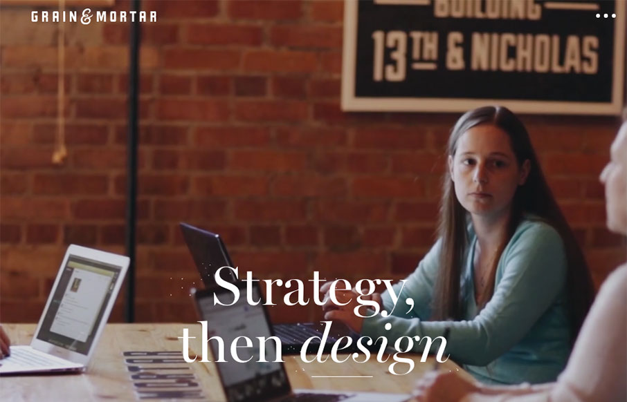
by Gene Crawford | Apr 14, 2016 | Gallery
Beautiful work. I love the feeling of richness this website exudes. From the photography to perfectly selected typefaces to match it’s solid from top to bottom. I especially like the rhythm of the page, going from larger hero sections to smaller more open blocks...
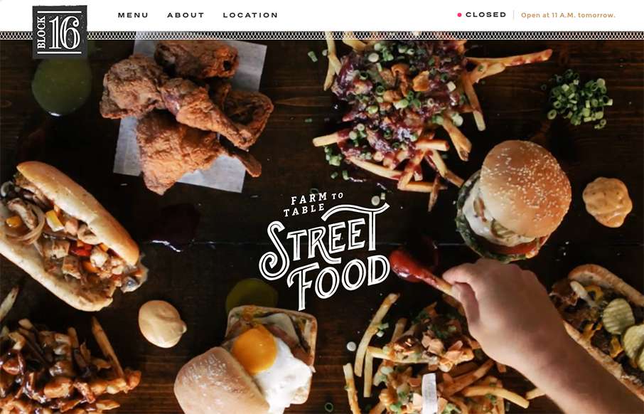
by Aaron Griswold | Nov 4, 2015 | Food and Beverage, Gallery
One more example of how restaurant sites are finally getting facelifts – love this one that Grain & Mortar did for Block 16 out of Omaha, Nebraska. As an aside – restaurant websites have always been horrible (here’s my 2nd site I ever made for a...
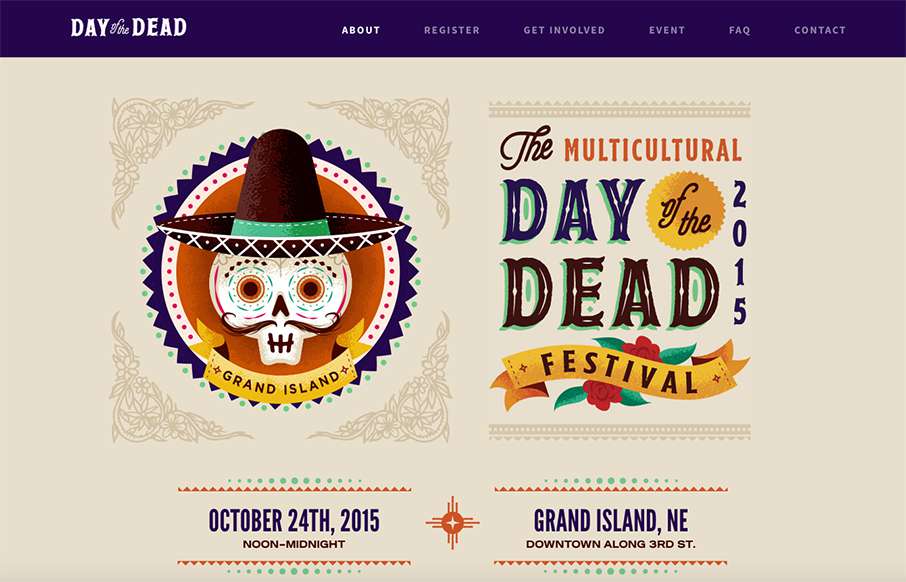
by Gene Crawford | Sep 3, 2015 | Gallery
Beautifully illustrated website for the Day of the Dead festival. I love the bold colors and stuff. My favorite is the “skull menu” that you get on mobile screen widths. Skulls beat Hamburgers every time.
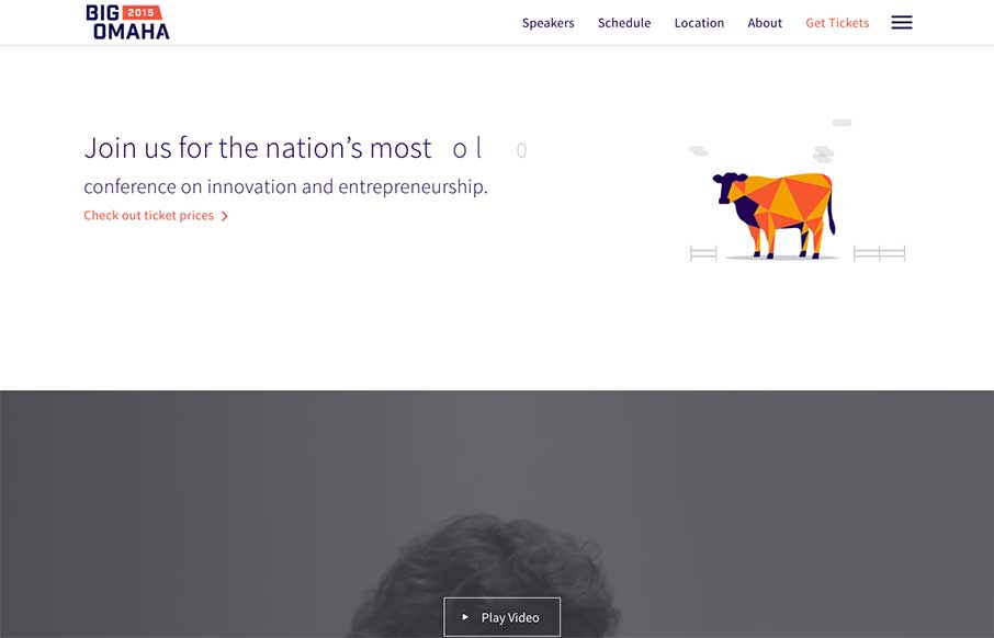
by Russ Pate | Mar 31, 2015 | Conference, Gallery
tl;dr – Details are the details – Built with Polymer ( I think ) – It’s really fast – page to page transition – good color palette – it’s really really fast – builds upon start up conference tropes – photo of...