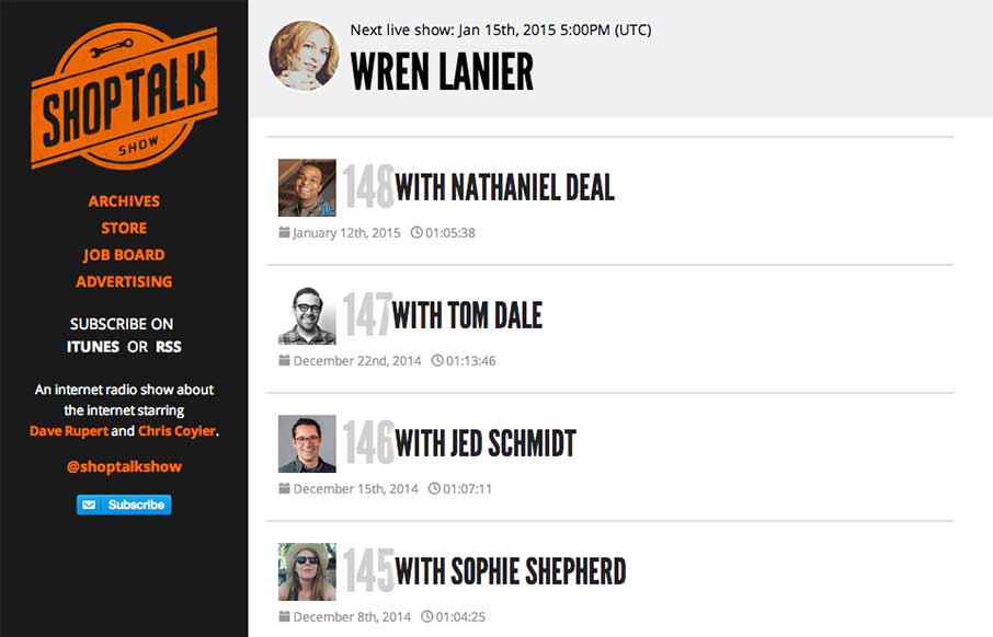
by Gene Crawford | Jan 13, 2015 | Gallery
The new Shop Talk Show website is up. Retaining the same branding and colors but very much looks like it just goes straight for mobile users. Likely a very smart move. The content is in the audio and getting people to that fast not in showing off a super slick site...
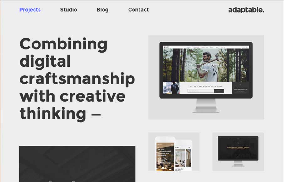
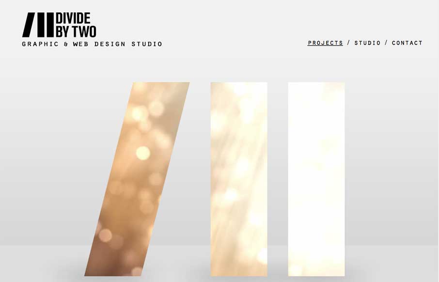
by Gene Crawford | Jan 12, 2015 | Design Firm, Gallery
I love this layout. It’s simple and to the point as well as a nice example of responsive design. The scaling of the main images is nicely done and in contrast the larger bolder type in the layout works our really well.
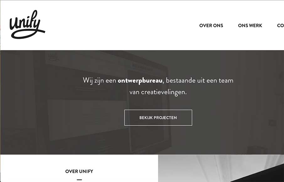
by Aaron Griswold | Dec 29, 2014 | Gallery
Very simple, clean, minimal site from Unify out of the Netherlands. What I really like is on their portfolio detail pages – they’ve posted they color palette and font’s they used. Would be cool if they named the fonts too – but this way you can...
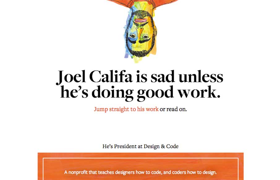
by Aaron Griswold | Dec 22, 2014 | Gallery
Theme of the day is clean and simple. Joel Califa’s portfolio site out of Brooklyn is exactly that. Love two main things: 1 – The “text-heavy portfolio” are really more than just “I did that” – there’s a ton of detail on...
by Gene Crawford | Oct 31, 2014 | Gallery
Nice simple layout. I like the logo treatment in the hero image space with the animation/video in the background of the letter forms. Nice touch there. Submitted by: Joana Carvalho Role: Designer & Developer This is my own studio’s website. We tried to...