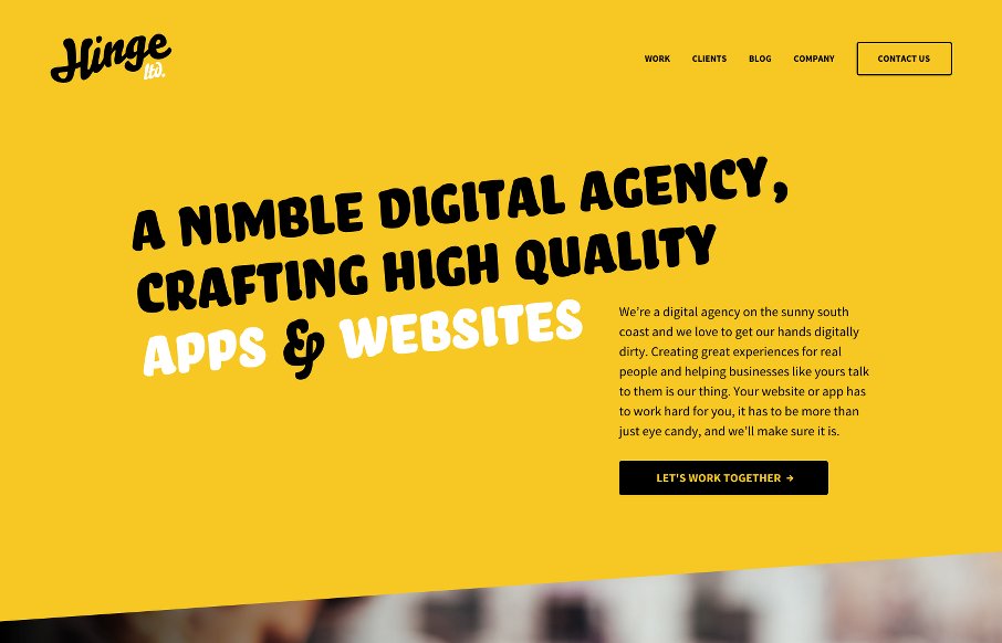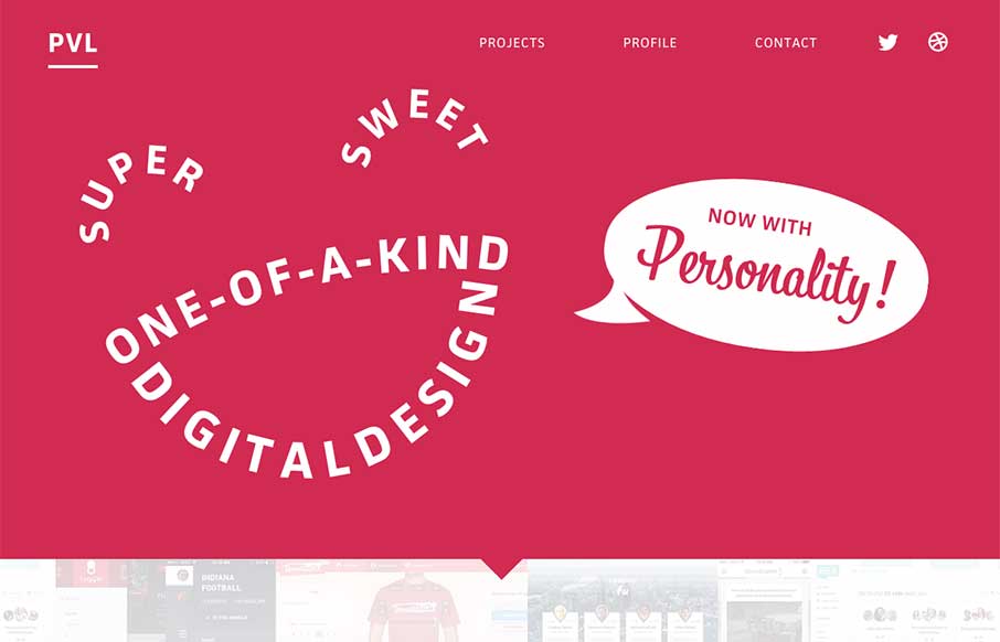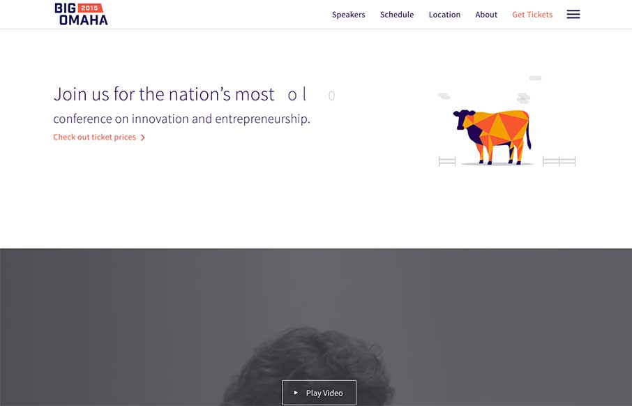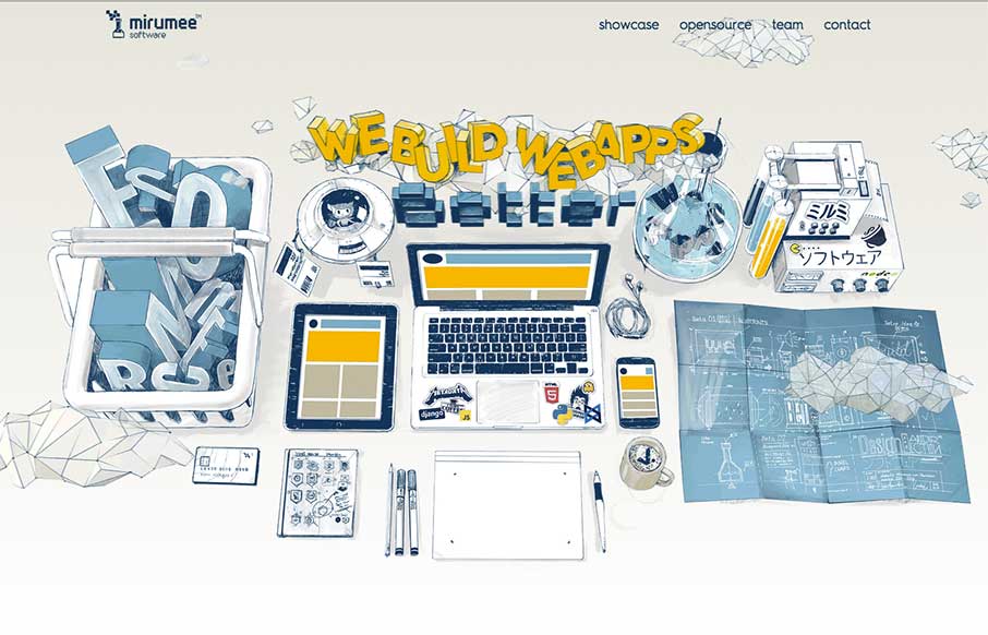
Boom. Sometimes that is just what you should say with a site review. Boom.
The Boat
SBS out of Australia has produced a website called 'The Boat' - which is an interactive graphic novel about escape after the Vietnam War - based on the story by Nam Le. Incredible use of scroll jacking and on-scroll actions in a parallax web universe. It's complete...
Bryanston
Great images permeate throughout this site for Bryanston School in the SouthWest UK - which is really good. I think the most interesting decision they made of the site was maybe for accessibility - there's a link in the footer to see the "High Visibility Version" of...
Radar #97
In this week's Radar: UX: a Process or a Task? Designing for Disappearing Interfaces Can You Fix a Bad Design? Here’s Where to Start How to Go from Freelancer to Professional Designer The Psychology Behind a Great CTA Why Mobile First May Already Be Outdated Design...
Levy Restaurants
Like the power of the video background on the Levy Restaurants site as you start - then like the hand-drawn fonts and icons. The site looks pretty hip and with it, which seems to be the aim of the restaurants themselves. @UKLevy
Xome
Pretty cool experience for a search based website. I like how the search is focused on top of the main hero image space. Keeps it front and center. There's very little small screen width experience here but overall for desktop it's tops. Cool form elements to play...
Casper
I just love it when a nice brand has a minimal approach to it's website. Casper is a great example of what a minimal approach can do for you. The messaging is crystal clear and simple and there are still some really great interaction sections on the site to boot....
GWT
Fairly straightforward design here. Clearly an informative experience, much like a book. The mobile view isn't that spectacular but it doesn't really have to be. I like the interaction on the search in the top right a lot.
The Chemical Brothers
The Chemical Brothers are back after a little hiatus - and since music is a personal thing, I'll just comment that I like their new stuff - love the new site too. It's wild, and fit's the band's image / music. Exceptional parallax work done on the History Page - don't...
Sulu
Good clean design on Sulu, a CMS built on Symfony. We almost listed it in Radar as a resource instead of the Gallery , but we liked the white space and the little animations that happen on-scroll. @sulu_io : Handcrafted in the Alps Privately funded by...
Master Channel
When we were in Nashville last week for BDConf, I walked into a concert for one of Master Channel's clients, (no, not R5 with Ross Lynch from Disney's Austin and Ally... which my kids watch..) but country star, Kip Moore. And yes, I used the website they built to find...
Quiet Revolution
As extroverted as I can be sometimes through my writing, among friends and family, and when I'm acting - I actually have an introverted nature in many social situations. That's part of the gist of the Quite Revolution (from a philosophy standpoint), based off of TED...
Brand Uber
Always interesting to see brand / design / style guidelines from companies and products you use on a daily basis, like this one from Uber. Very clean and minimal, but with a few little interaction pieces - you can see they've taken time to make this section of their...
Restaurant Bon
Elegant and simple site for Restaurant Bon out of Paris - designed by Uniiti also out of Paris. Two things to point out - on the Food Menu (Carte) page, the use of the sticky positioning of the side bar is smart. Also, like the reservation modal and how it fits in...
The Fallen
The Fallen is an interesting website, especially to a history and WWII buff like me. Granted, the majority of the site is video based - but as the author / coder Neil Halloran points out, "In the interactive version, the interactions are at around 7:21, and 16:17. And...
AIGA Design Conference 2015
AIGA just released their site for the AIGA Design Conference 2015 (in October). Lovely all the way around - from the "revival" art (that might be changed out periodically? See the current site and the image below) - to how everything works on-scroll. Looking at the...
Radar #96
In this week's Radar: 12 Gurus Got 5 Questions About How They Set Their Rate Why Web Design is Dead How To Export SVG Patterns Sticky Positioning with Nothing but CSS Copy & Paste & The Web How To Center In CSS Page Scroll Effects How To Design Social Media...
Channel Islands Surfboards
What says "cool" better than a surfboard? Really besides the spectacular images of surfers and the surf community, the best part for me is the informative pages for surfboards themselves (including some with a 3d preview) and the interactive customizable 'Board...
Brighton i360
Starting to really enjoy things and sites coming out of Brighton, like this one for Brighton i360. Good grid-centric design - clean and simple. Looking forward to it being built and visiting.. next time I'm in the UK. @TheBrightoni360 made by @wearetilt
To-Do App UI Kit
Cool landing page from InVision with their new To-Do App UI Kit. Love the intro - the CSS animation of the cloud .png overlaid on the mountain .jpg makes it look like the mountain and clouds are a video background. Looks like they share every single possible layout...
Anton and Irene
Pretty stellar agency/non-agency site from Anton and Irene, built by Oleg Chulakov. Avant-garde was the first thing that came to mind when landing on the site - pretty darn cool was the next thought. Love the different pieces of the site, but equally love the...
UXPin
"Design is really about solving problems" - Amen. I can see that UXPin's philosophy, matches the way they go about their design for their site too. Love the simple home page, that is still layered with a video background of the product, but more as texture than a main...
Family Trails
Good looking "Family Trails" site from the National Center for Families Learning. It's a very social site, and essentially it is a travel type blog, which seems to work very well for what the NCFL is trying to accomplish. @Family_Trails
Lehigh CBE
Like the clean site from Lehigh University College of Business and Economics - think it has good (and appropriate) UI / UX, even down to the main content / sub-pages. Like how they have the hamburger menu below the hero image so that you can go into more detail on the...
County of Monterey
The above screen shot from the County of Monterey's new website may be the single best feature of their website - that's not to say that the site isn't pretty decent on it's own (don't know if you know that government sites usually, well, stink...) - but a government...
Dennys
It's breakfast time in Nashville, Tennessee where we're putting BDConf (www.bdconf.com) on this week. we just finished setting up, and I'm watching the dude get the breakfast ready for the attendees... and then I see this site in our inbox - Denny's. We have one in...
Happy Apps
Pretty fun scrolling animation of the wires/tubes that connect the sections for you visually. I like that part of it, it makes what is fairly standard fun. Would be extra super great for it to be responsive, but there's always reasoning behind stuff so I won't judge...
Seven Shores
It's not often you see a restaurant or cafe website made entirely out of HTML/CSS. I know that's crazy right? This one isn't spectacular but it's efficient and perfect for the need. That's why I think it's beautiful, really! Also... it's made using squarespace.
Tree of Human Development
Pretty rad interactive element here. The tree that you get after completing the form is brilliant. Go take a peek and play around with it.
Fast Forward Labs
I dig this simplified layout approach of the Fast Forward Labs website. At it's core it's straight forward and simple, but lay on some neat visuals like the animated mind map graphics and it's pretty darn cool.