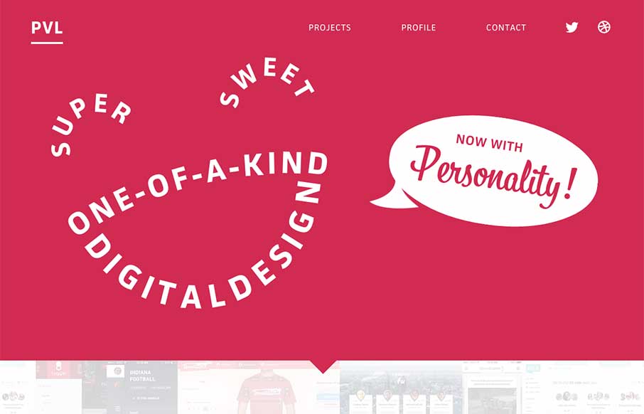
To say Isaac Paavola has moxie is kind of an understatement based on his portfolio here. It’s intro is unexpected, and then there is good fading of sections as you scroll down. The movement of the portfolio banner is a sweet idea, and like how it’s used again as background for the Profile section. I just wish he was a little more extroverted in describing himself – jk.
Glassmorphism: The Transparent Design Trend That Refuses to Fade
Glassmorphism brings transparency, depth, and light back into modern UI. Learn how this “frosted glass” design trend enhances hierarchy, focus, and atmosphere, plus how to implement it in CSS responsibly.


This site is so fluid. At least as far as I can tell. Good find mah dude
werd