
by Gene Crawford | Oct 28, 2014 | Gallery
Very intriguing layout. I like the main hero image area and the way pieces scroll into view. The map and contact form have a nice designery touch too.
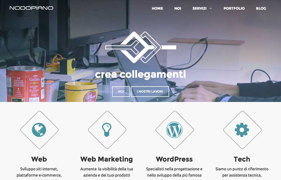
by Gene Crawford | Oct 27, 2014 | Gallery
It’s always nice when there’s a strong base to a design and always awesome when you layer good detail work on top of that strong base. That’s what the Nodopiano site design does so well. This is my last work,the website for an italian web agency....
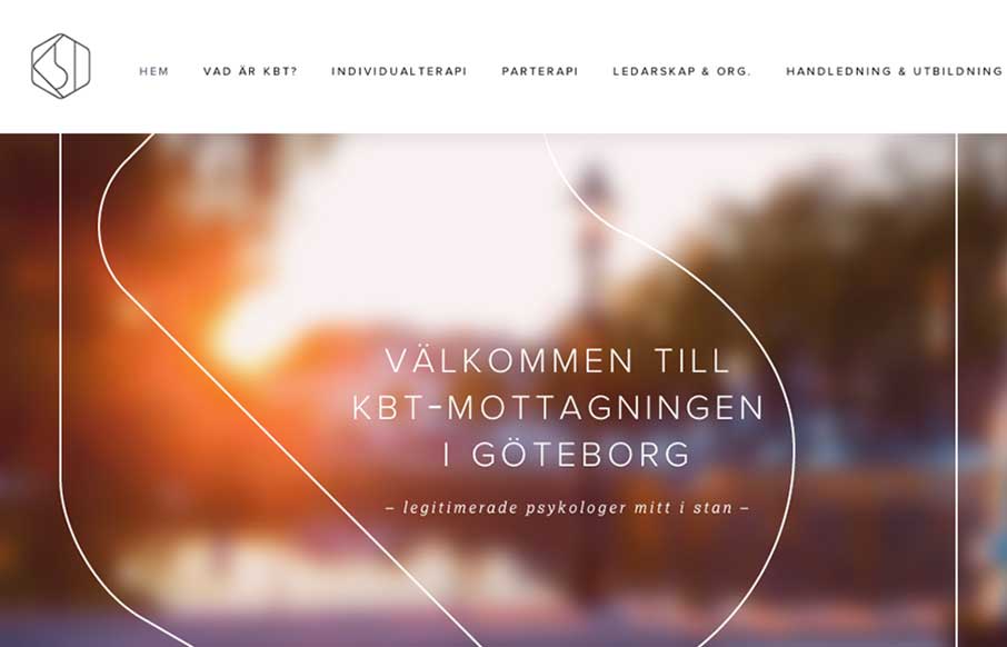
by Gene Crawford | Oct 16, 2014 | Gallery
What a great visual mark; the KBT logo. I’m probably biased, since I love everything Swedish. But man it’s hot. I love the light feel to the design and the colors throughout. I do wish it was responsive, but it’s hard to tell sometimes how old a site...
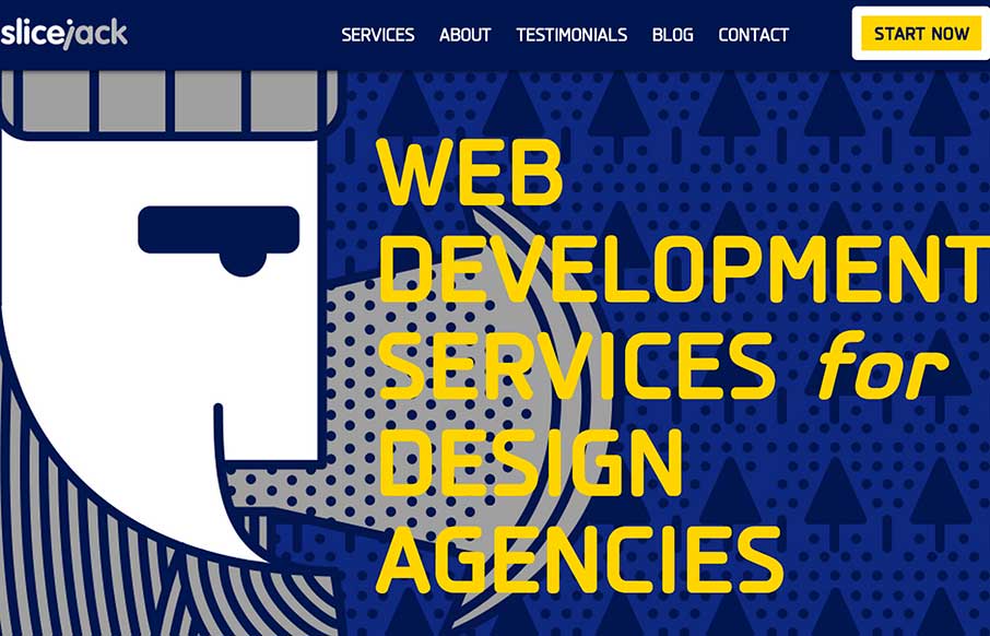
by Gene Crawford | Oct 13, 2014 | Gallery
Super strong colors and bold graphics define the Slice Jack site design in a good way. I really dig the scroll animation of the axe too.
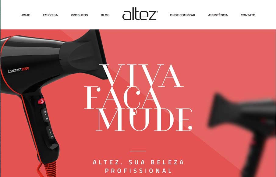
by Aaron Griswold | Oct 2, 2014 | Gallery
I like the trend that Altez follows – sites associated with the beauty industry have the hi-fidelity of slick industry magazines. It plays well for this site. My only suggestion is on the map – since the site is full-width (which adds to it’s...