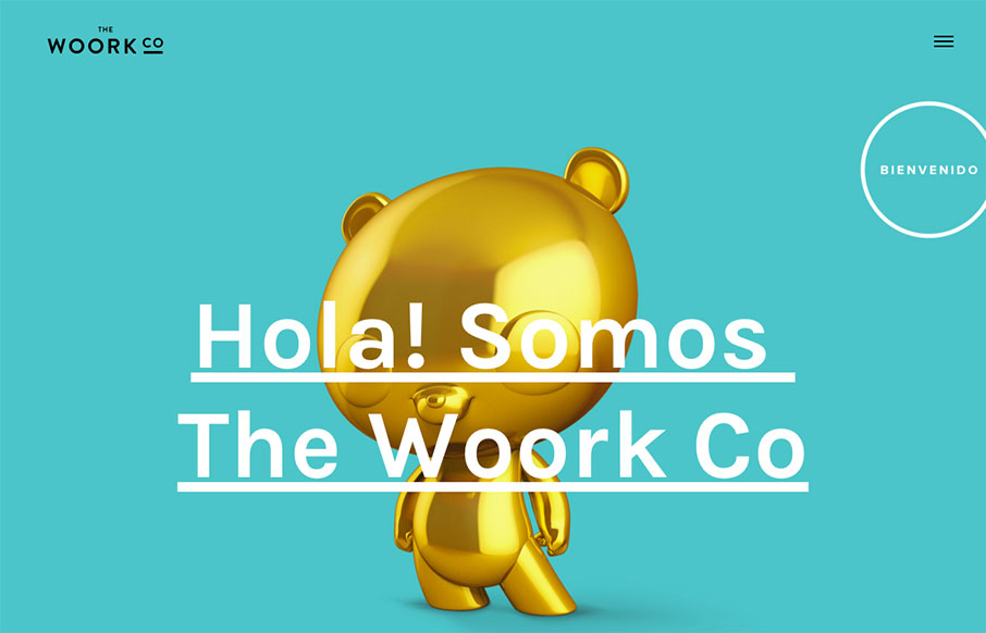
by Aaron Griswold | Feb 22, 2016 | Gallery
Bienvenido to your Monday – here’s a quick site out of Madrid from The Woork Co. I like the little surprise of the animated gifs in the block design as links to their work. The whole site is very clean and crisp and solid. From the Designer: Madrid based...
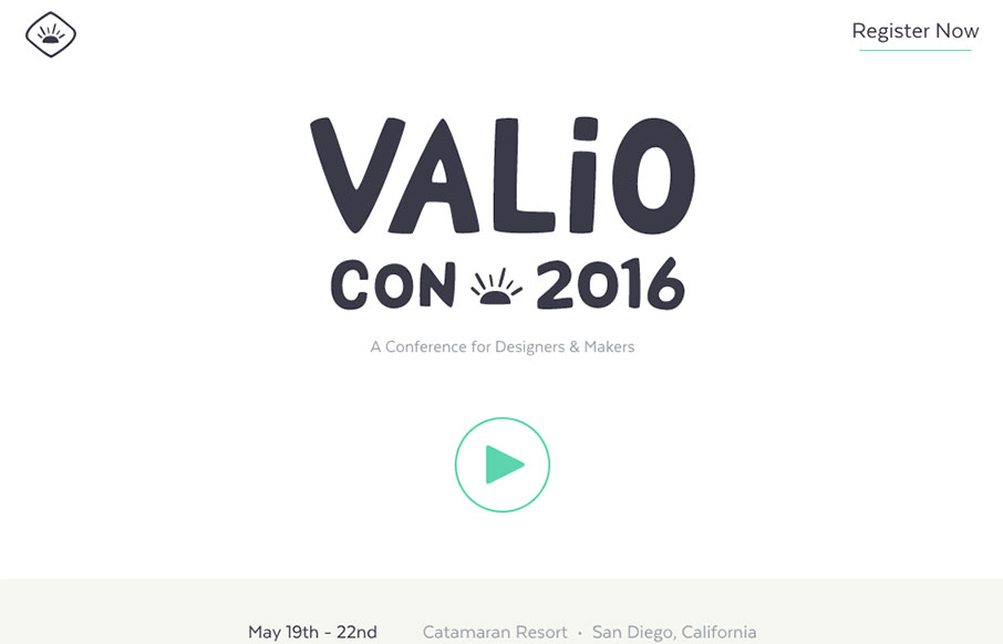
by Aaron Griswold | Feb 18, 2016 | Conference, Gallery
Smooth, and seemingly minimal work from the Valio Conference out of San Diego – the site looks great on desktop and mobile, and kind of has a cool parallax effect between speakers. Also love the Instagram-feed looking slide-show – nice touch!
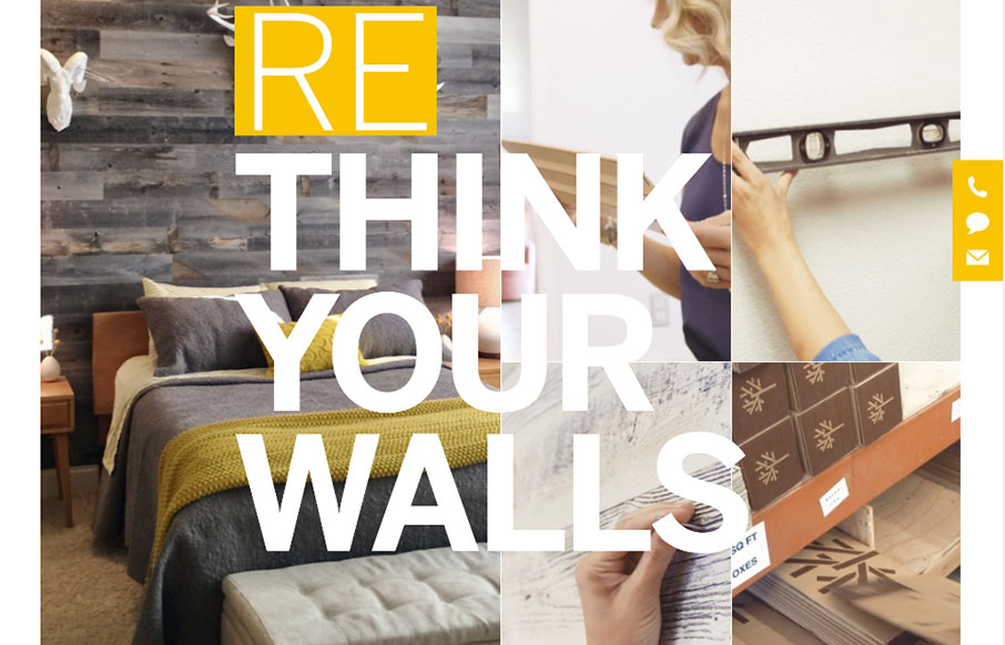
by Aaron Griswold | Feb 16, 2016 | Gallery, Product, Shopping
We get a lot of agency sites submitted to us – all tricked out, with enough time spent to question whether they do any client work at all. And.. their client work is never up to par with their own site… So – it’s great when we get a site like...
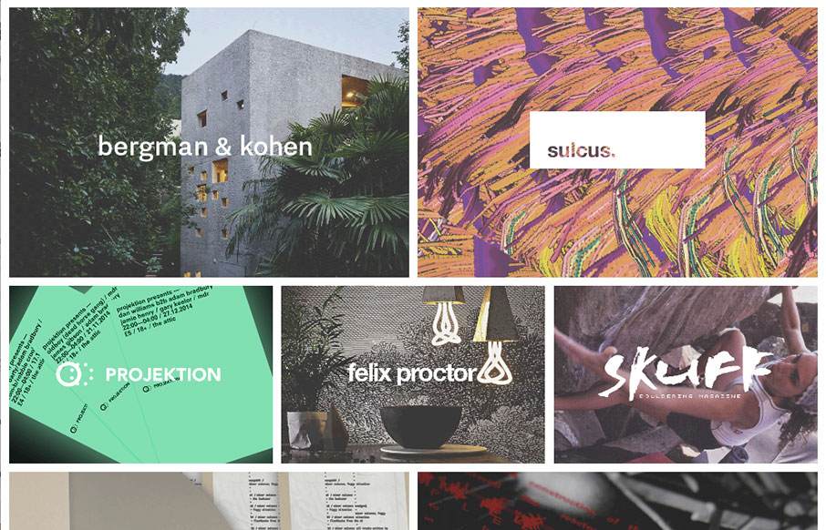
by Aaron Griswold | Feb 16, 2016 | Gallery, Portfolio
Good looking block design portfolio site from Benjamin Walton out of the UK. Great mix of work images on the home page – and cool typography work too. From the Designer: recent university graduate. freelance design & development. Submitted by: benjamin...
by Aaron Griswold | Feb 15, 2016 | Blog, Gallery
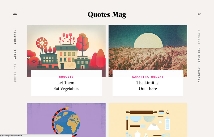
Good looking, minimalist blog site out of Bulgaria for Quotes mag – a project of Next-DC. Great card design, cool flat illustrations for blog post headings, and love the typography. Here’s a little more about it: “Quotes Magazine is a collection of...