Der Keim

http://www.derkeim.com/

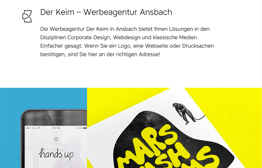
I love the off balance feeling of this layout. The header area is very light visually then below is a heavy image and colorful work section. This immediately draws my attention where it needs to go. Solid looking work too.

From the Designer:

Clean and colorful Portfolio of Designer Wolfgang Keim.

Submitted by: Wolfgang Keim
Twitter: @keimtweet
Role: Designer & Developer
Country: Germany

0 Comments

Submit a Comment

Your email address will not be published. Required fields are marked *

News & Articles

Sign-Up: Enhancing Conversions through good UX

Sign-Up: Enhancing Conversions through good UX

Optimize your website’s sign-up process by focusing on clarity, ease, and user mindset. Clearly explain the purpose, benefits, and steps, and use social proof to build trust and drive conversions.

The Essential Guide to Getting Started on Freelance Writing

The Essential Guide to Getting Started on Freelance Writing

Explore the lucrative and fulfilling world of freelance writing with our essential guide. Learn about specialties like blogging, social media, article, and technical writing. Build a portfolio, find work, set up your business, and discover the potential earnings. Embrace the freedom of working from home and follow tips for success in your dream career.