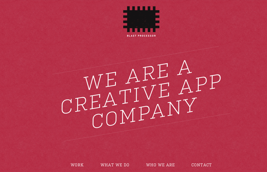
by Gene Crawford | Nov 14, 2012 | Gallery
I love the red color and texture used for the main intro section and header for the Blast Processor site. I also like how the header slides into a fixed position and at the same time the main nav slides to the right. Overall a nice clean layout that works well in most...
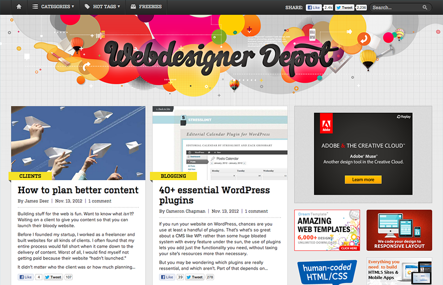
by Gene Crawford | Nov 14, 2012 | Gallery
The latest redesign of Webdesigner Depot is pretty epic. Parallax based art in the header, a stark change in layout and it’s responsive. The site is very much worthy of some in-depth study for sure. My favorite part of this design is the large buttons near the...
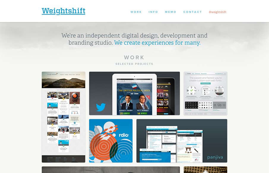
by Gene Crawford | Nov 13, 2012 | Gallery
Superb responsive design decisions made on this newest version of Weightshift’s site. Making the portfolio images get smaller and more button like for the iPad and iPhone screen widths is brilliant. I also think the focus on the selective nav elements as you get...

by Gene Crawford | Nov 13, 2012 | Gallery
Really beautiful product website here for AddThis. I’ve always liked their design and this one with the push for simplicity is the best to date. The animated background works really to give it some visual interest while not creating too much noise.
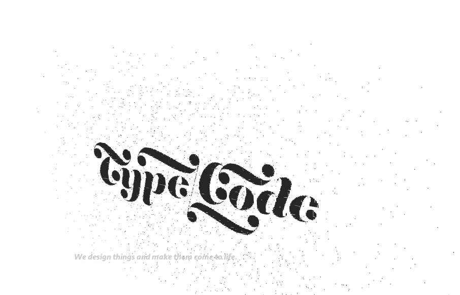
by Gene Crawford | Nov 7, 2012 | Design Firm, Gallery
Great interactions mark this website for me. I like the playfulness of the Typecode logo on the initial load/home page. Then the fixe nav and side scrolling load make the site feel very exotic. Clean and almost stark with the black and white make the work stand out...