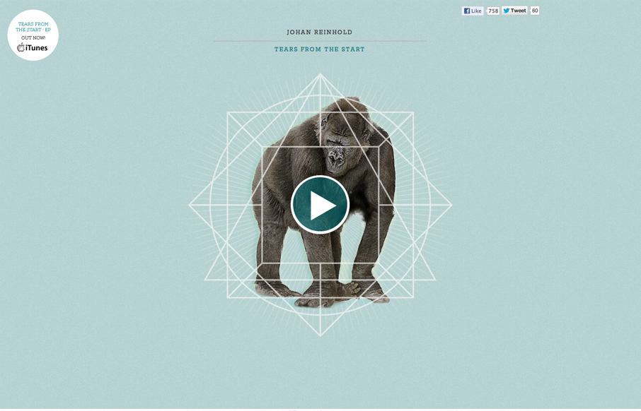
by Gene Crawford | Dec 11, 2012 | Gallery, Music
Submitted by: Johan Reinhold Role: Designer & Developer Official website of Swedish electro-pop outfit, Johan Reinhold. I like the interaction animations worked into this site. Like the gorilla and the beating heart illustration. I think the way it’s...
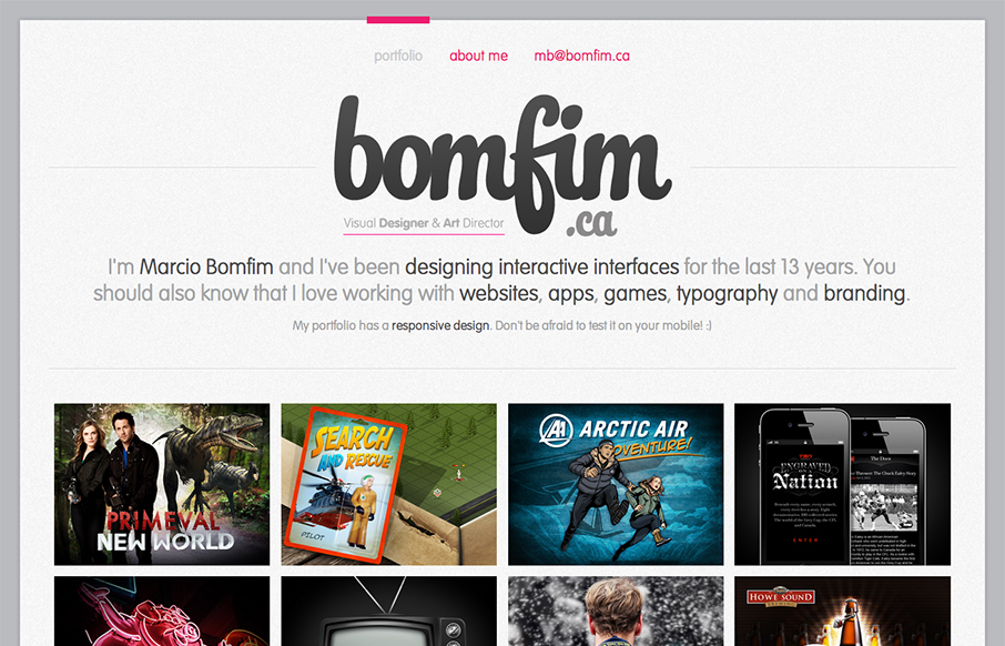
by Gene Crawford | Dec 7, 2012 | Gallery, Portfolio
Damn, I love websites that just embrace their purpose and put it front and center to the core of what it’s all about. This website is a portfolio, so make that the home page. Brilliant! I also love the “A bit more about me…” part of the about...
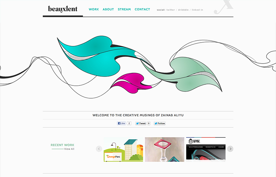
by Gene Crawford | Dec 6, 2012 | Gallery, Portfolio
It’s a pretty standard and simple layout but accentuated by that nice leaf illustration. That illustration is the central focus of the design and makes you really start your visual journey around the page there in the center of the page almost.
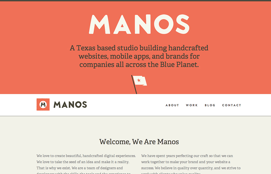
by Gene Crawford | Dec 6, 2012 | Gallery
Super beautifully crafted website design. The colors, typography layout choices – it just sings! Just beautiful! I really love how the main nav slides up to be a fixed header from the home page on. Seamless and smart feeling.
by Gene Crawford | Dec 5, 2012 | Gallery
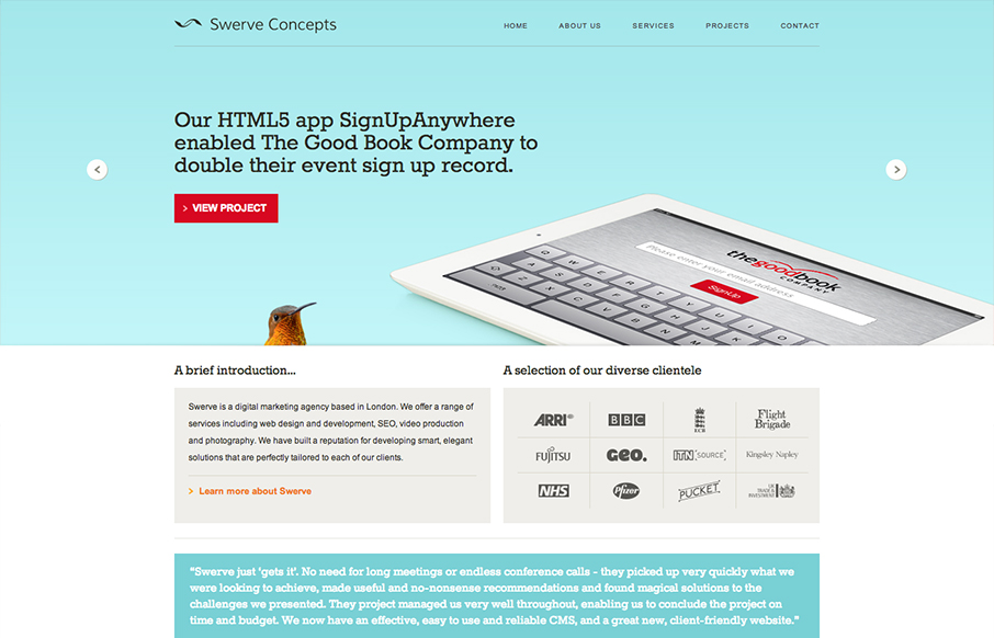
I like the clear blocky grid for this design. Right angles and squared off images, then the big oversized slideshow at the top. Pretty common layout formula but it’s pretty groovy here to me. Pretty funny use of the animal heads throughout the site. Humor is...