by Gene Crawford | May 15, 2013 | Gallery, Portfolio
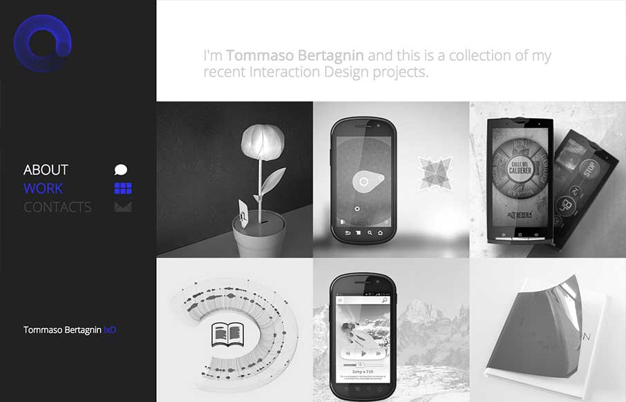
Deceptive simplicity. I love this stuff. This site is one of the first i’ve seen that goes from it’s initial layout to something almost completely different as you get to the smaller screen sizes. Going from the left nav to a top nav like that is just cool...

by Giovanni DiFeterici | May 14, 2013 | Gallery, Shopping
Okay, lots of things to love about the Ditto site. 1. Super clean, beautiful design with no fluff. Gets the job done with style. 2. Awesome product. Haven’t tried out the service but looks super cool. If anyone has gone through the camera thing, let us know how...
by Gene Crawford | May 14, 2013 | Design Firm, Gallery
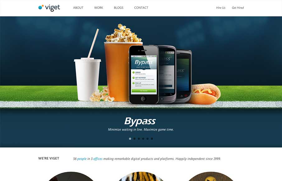
There is a lot of good looking design scattered across this website. Each page looks like it has had the same amount of love and attention paid to it as the home page has. I love it when I come across a site design like that, that’s so thorough and finished...
by Gene Crawford | May 10, 2013 | Gallery
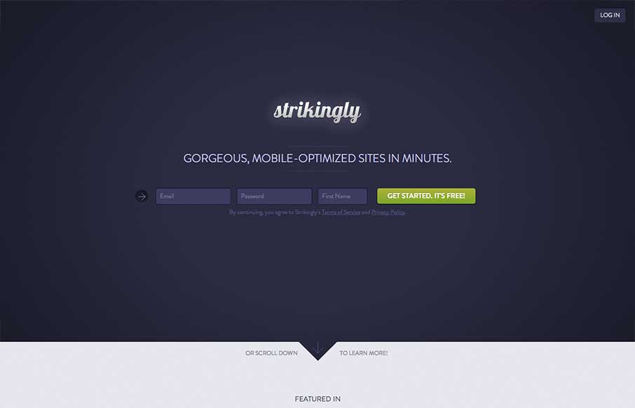
I like the minimal approach mixed with the full on product tour in the middle section of this site design. You start and finish with the same form layout as you scroll through the page. I also study sign up forms a good deal and I like the horizontal layout of the...
by Jay Barry | May 10, 2013 | Gallery
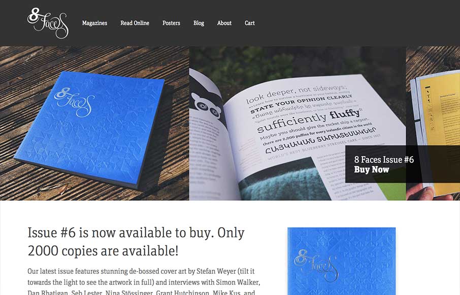
The whole point and appeal of 8 Faces is the tactile, printed objects that they produce, so much so that the website might seem like an afterthought regardless of how well it’s designed. Luckily it’s a great example of simple, effective design. The purpose...
