
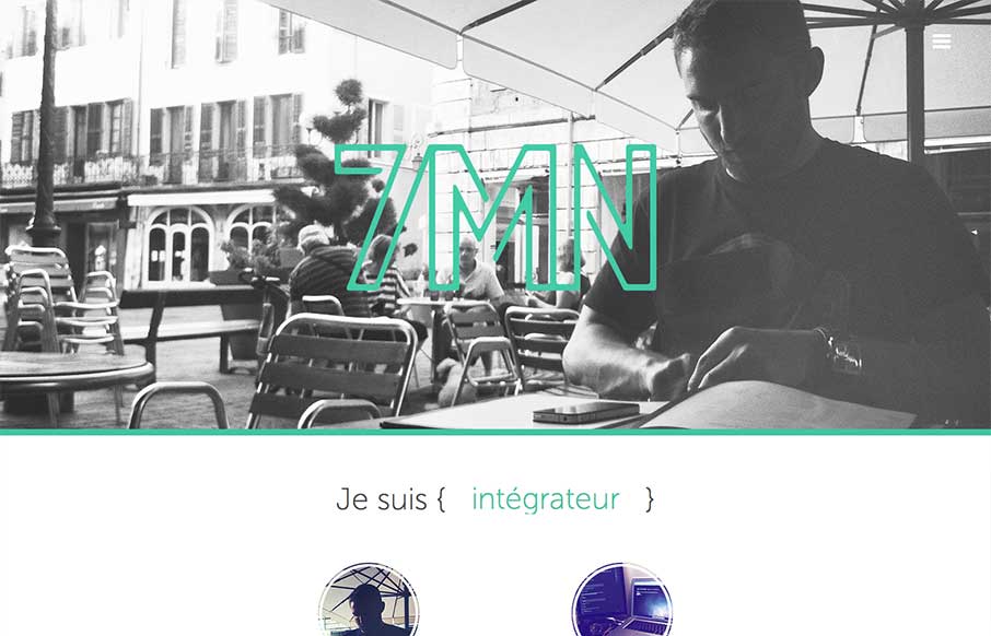
Pretty cool single page website design. The way there is a slight parallax feel to the header, then the way the nav slides into place is very well done. I also like the simple different views designed for the smaller screen widths. My favorite is the green color and keeping it largely monochromatic, not sure why I just dig it.


Fitts’s Law: Why the Easy Button Wins
Large, close targets are faster to hit than small, distant ones, that’s Fitts’s Law. A look at the 1954 rule behind buttons, prime and magic pixels, thumb zones, and dark patterns.


0 Comments