by Mary Krug | Jun 4, 2014 | Gallery
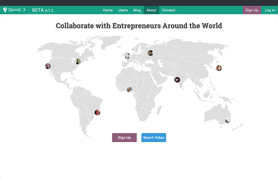
Sproutr is great because there are lots of different forums and communities on the web for communicating with entrepreneurs, but none that have put the same amount of consideration into the design and UX of their site. Sproutr is very clean and easy to use. Within...
by Gene Crawford | Jun 3, 2014 | Gallery
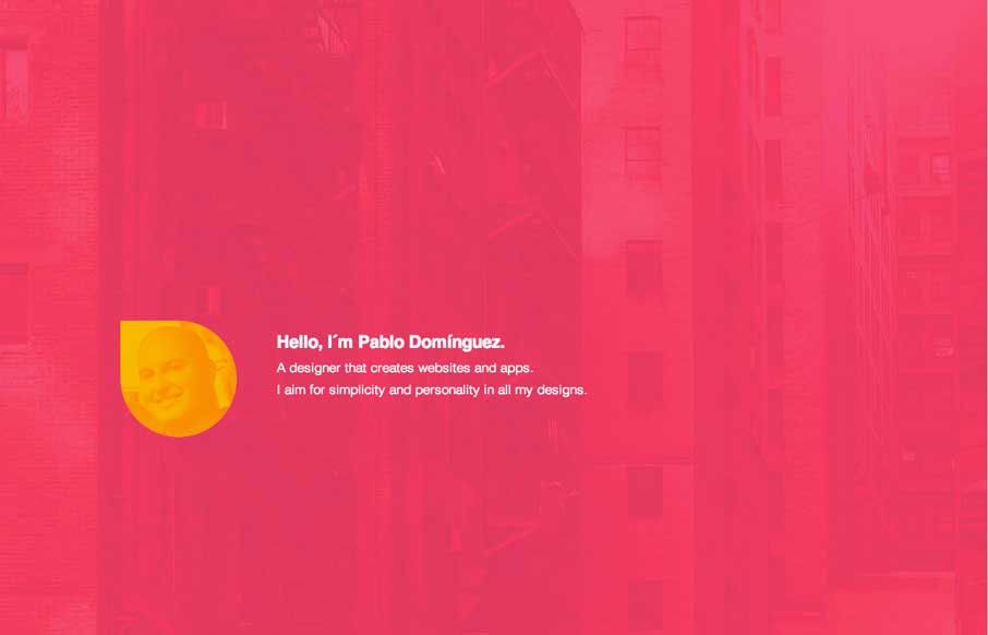
Great minimal approach to this designer’s site. I love it. There is some special work done to each case study page too. Check it out.
by Gene Crawford | Jun 3, 2014 | Education, Gallery, Nonprofit
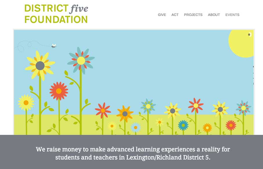
I love simple design, it’s not as easy to pull off as you first think it is. This is why i’m always impressed when I find someone who has. This site for District 5 Foundation is one of those. Well thought out, well designed, deceptively simple websites. By...

by Gene Crawford | Jun 2, 2014 | Gallery
I love narrative in a site design. This site is such a good narrative experience to scroll through. Well done.

by Aaron Griswold | May 29, 2014 | Gallery
We hosted ConvergeSE this year in the Columbia Museum of Art (CMA). It was cool as we were running around, getting everything set up, whizzing past 16th, and 17th century paintings, to just stop and stare at the art for a few minutes – connecting to the past....
