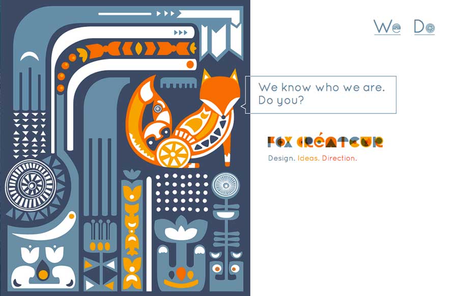
by Aaron Griswold | Oct 24, 2014 | Gallery
This site wasn’t submitted to us. I found it when I was looking at one of Fox Createur’s client sites for a review. This gets down to two things that I love with great websites – simplicity and creativity. Hover over the image(s) on the right –...
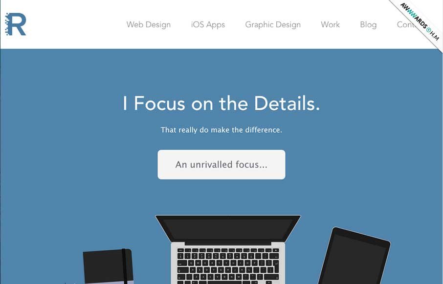
by Gene Crawford | Oct 22, 2014 | Gallery, Portfolio
Super nice illustrations to kick the page off with, then followed up with some nice detail work and good copy. Love this straight forward but thoughtful approach.
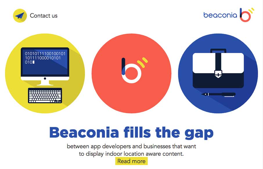
by Gene Crawford | Oct 22, 2014 | Gallery
Very slick details. I love the mix of illustration/icon work and the photos. Add in that nice little interaction with the animation and i’m thinking you’ve just grabbed people’s attention. Good work. Submitted by: Darius Krisiunas Role: Designer...

by Gene Crawford | Oct 21, 2014 | Gallery, Portfolio
Really slick visual style for this portfolio site. I really dig that header/hero area photo, good stuff. The icon work and vector feel across the page is real nice. Hire this guy for some projects!
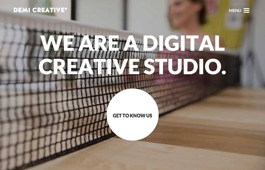
by Gene Crawford | Oct 21, 2014 | Design Firm, Gallery
Big bold visual style for Demi Creative. I dig it. I like the simplicity implied into the site design, the main link is the “get to know us” call to action and it draws you in. The nav under the hamburger icon feels slightly lost but once you dig into the...