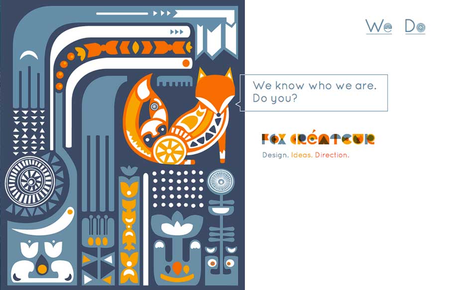
This site wasn’t submitted to us. I found it when I was looking at one of Fox Createur’s client sites for a review.
This gets down to two things that I love with great websites – simplicity and creativity.
Hover over the image(s) on the right – now start clicking around. Is it gimmicky – no, it’s cool that you can have that much interaction in something that on first view seems so static. That’s not even the creative part.
This may be in other sites, but I haven’t seen it until now – their navigation is two words: “We” and “Do”.
And.. if you’re putting up an agency or portfolio site – those two pages are probably where you should stop.
This site is smart, simple, creative and unique. Go and give em’ some love!


Clear and creative.
Indeed Sir!