by Gene Crawford | Nov 20, 2014 | Gallery, Portfolio
Really like the photography and typography on this portfolio website. It’s smooth feeling to me as I scroll with it. Also, you gotta dig the loch ness monster on the contact page there.
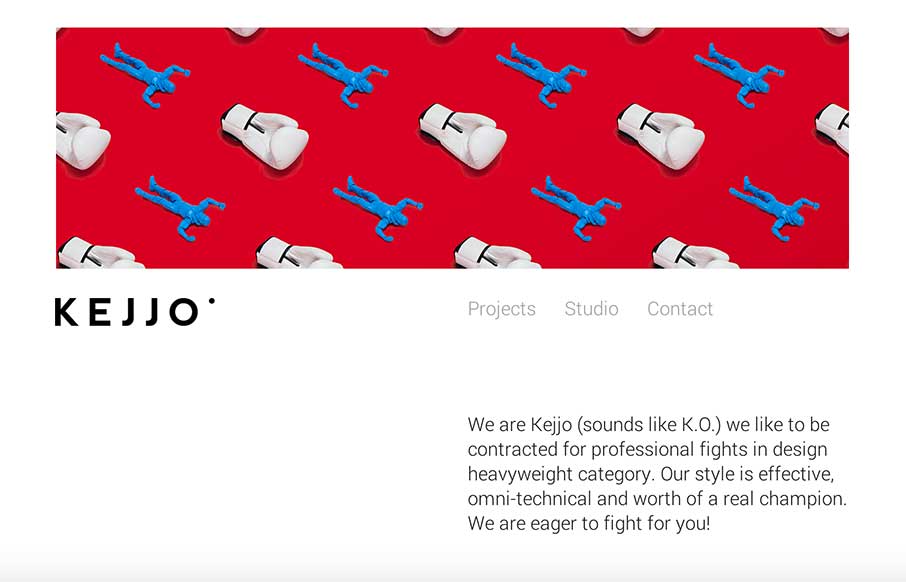
by Gene Crawford | Nov 20, 2014 | Gallery
Love the header/hero image! I also really like the subtle shift in the header nav that scrolls up into position then fades away as you get into looking at the designer’s work. Love this site so much. Submitted by: Kejjo Kejjo We are Kejjo (sounds like K.O.) we...
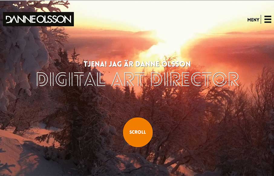
by Gene Crawford | Nov 20, 2014 | Gallery
Very nice experience scrolling this site. I like the header/splash area and then how it flings you down into more content.

by Aaron Griswold | Nov 19, 2014 | Gallery
Awhhhhh….. If this app wasn’t free, I’m sure my family would spend all our money to obtain it… but that’s not important now. The app product page itself is a great design – flows easily – has great parallax work and good...
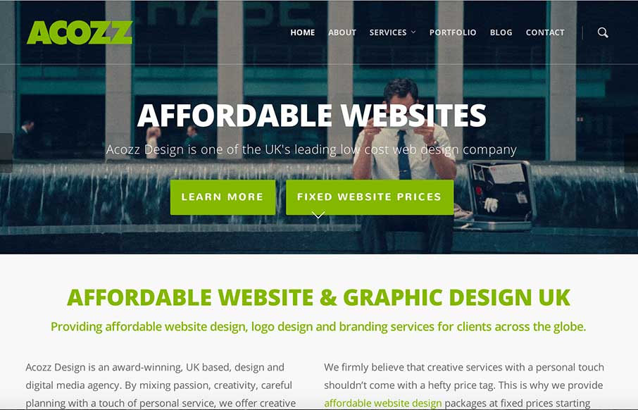
by Gene Crawford | Nov 18, 2014 | Gallery
Pretty clever and simple looking site for the web design agency Acozz Design. I dig the colors and the amount of content they’ve developed is wonderful. I particularly like the animated gif work on the headers. Though i’m not wild about the transition...