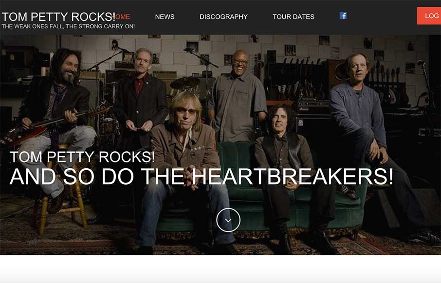
by Gene Crawford | Nov 18, 2014 | Entertainment, Gallery, Music
Man I love some Tom Petty, so does this guy. It’s a nicely designed and executed responsive design featuring one of the best subjects. I love it. If you like Tom Petty, you’ll love tompetty.rocks! Formerly gonegator.com which was reviewed by USA Today and...
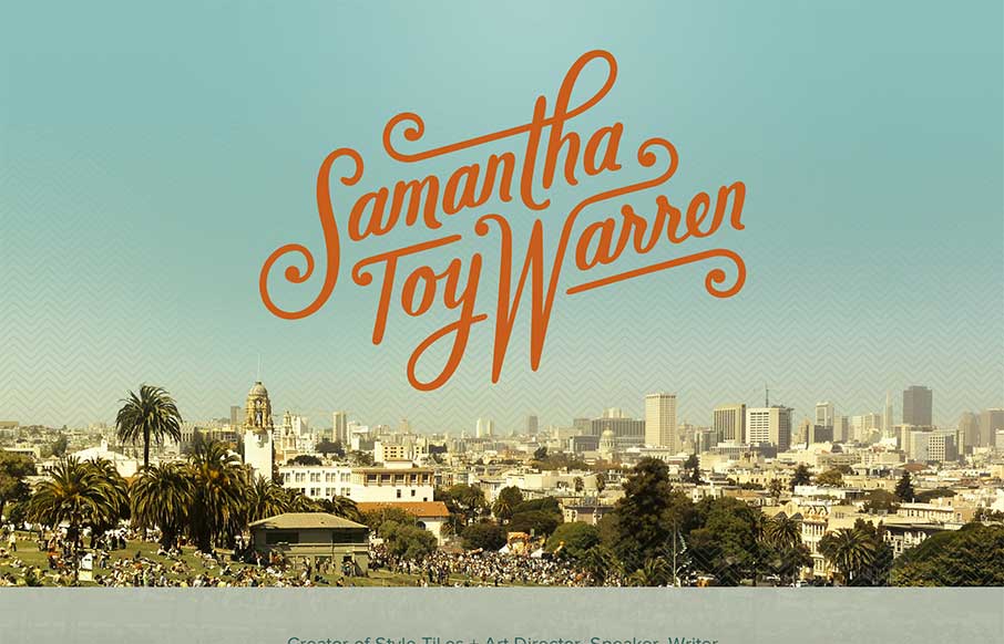
by Gene Crawford | Nov 17, 2014 | Gallery, Portfolio
Nice simple site to tell us what Samantha does. Love it. I really dig that logo type of her name. Super badass. Then the geographic photos worked into the layout help tell the story of where she lives and stuff. Smart work.

by Gene Crawford | Nov 17, 2014 | Gallery, Portfolio
I like the imposed high quality feel to this design. From the photography to the tight typography it has a great vibe. I especially like the languages section/design thing. Smart.
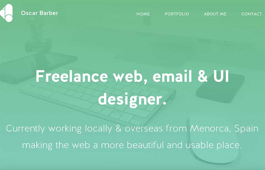
by Aaron Griswold | Nov 13, 2014 | Gallery, Portfolio
Oscar Barber has a good clean portfolio site. Sometimes that’s just perfect – forget the bells and whistles and just make something good – Oscar did. Submitted by: Oscar Barber Twitter: @oscarbarber Role: Designer / Developer “Hi, this is my...
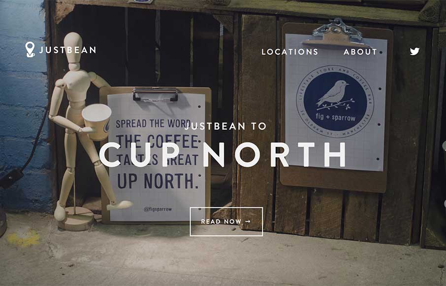
by Aaron Griswold | Nov 12, 2014 | Food and Beverage, Gallery
I’m on a small movie set right now with my jugged coffee from the caterer, in a styrofoam cup, with some International Delight French Vanilla creamers in it… and then I look at this site – I am envious, and want to be in Manchester, UK right now....