
by Aaron Griswold | Dec 21, 2015 | Gallery, Shopping
Decent site from Snipcart out of Quebec – one thing I like is the mega-dropdown in the nav – keeps the site cleaner. Also like the line illustrations on each page (and in the nav) – cool. From the Designer: Complete marketing website for Snipcart, a...

by Aaron Griswold | Dec 21, 2015 | Gallery, Software
I want one. Cool site from Vinli that allows wifi and apps for your car – I like the movement and quick svg line drawings to give a cool, but light feel to the site. And, um, I want one.
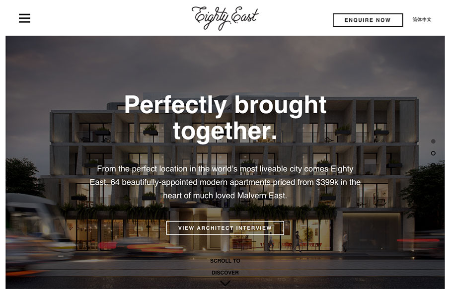
by Aaron Griswold | Dec 17, 2015 | Gallery, Real Estate
Good looking real estate site for Eighty East out of Melbourne, Australia – done by Yoke. I actually like the Chinese version a little better – the characters fit in with the aesthetic of the site even better in that version. Twitter: @welcometoyoke Role:...

by Aaron Griswold | Dec 17, 2015 | Gallery
Fun, fun, fun. I like this site from Molamil out of Denmark – even if the wack-a-mole heads of the employees are a little creepy… Great transitions into other pages – and fun vibe all the way through! Submitted by: Joakim Norman Twitter: @molamil...

by Aaron Griswold | Dec 17, 2015 | Entertainment, Gallery
We don’t review political websites normally – And – maybe I’m a little politically jaded, but he’s the only candidate that I’ve seen that’s actually honest with his intent. If you don’t immediately recognize this as a...