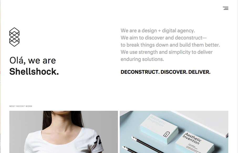
by Aaron Griswold | Dec 28, 2015 | Gallery
Good design work out of Rhode Island from Shellshock. Really like the look of the hamburger drawer nav, like the rest of the site, is very clean and easy to navigate. From the Designer: We’re a design + digital agency based in Providence, Rhode Island. After a...
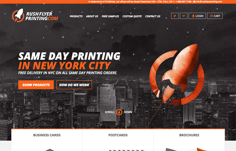
by Aaron Griswold | Dec 28, 2015 | Gallery
We’ve done some work for some printing companies (both 2 and 3d) in the past year, and know how hard it can be to merge the design side of a client facing website, with the functionality of an ordering web app. This site from Rush Flyer Printing out of NYC, is a...
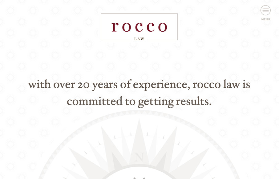
by Aaron Griswold | Dec 22, 2015 | Gallery
We’ve seen and built hundreds of law sites – so always interested to see other’s takes lawyer sites. This one for Rocco Law out of Philadelphia, built by Blinebury Design – is very good. It’s the small things that get me – besides...
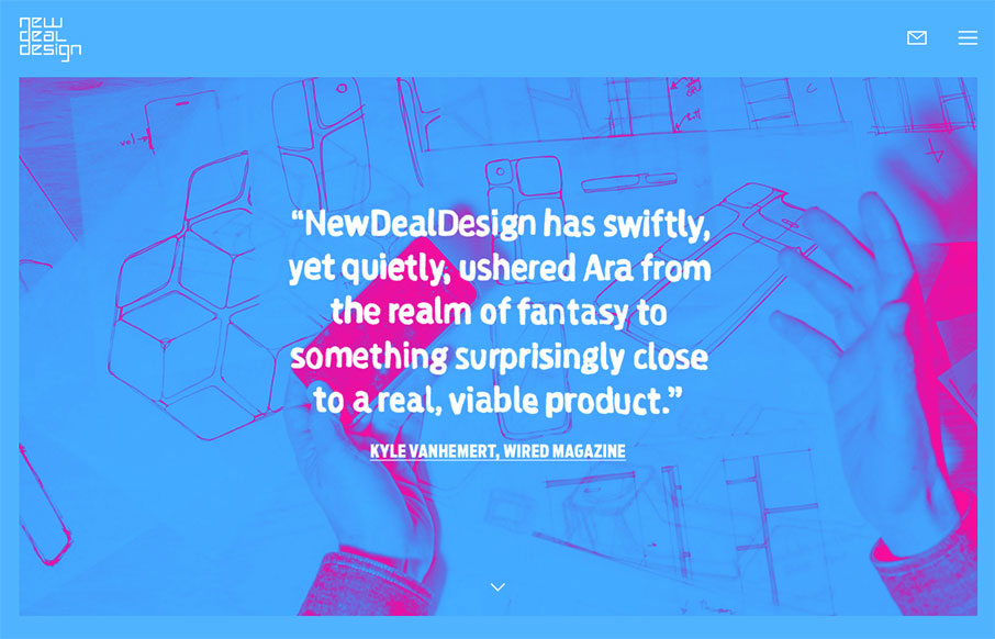
by Aaron Griswold | Dec 22, 2015 | Design Firm, Gallery
Good stuff from NewDealDesign out of San Francisco. The site’s cool and vibrant – their work is freaking awesome. From the Designer: Matchmaking people, culture and technology, we build joyful physical and digital experiences for innovators big and small....
by Aaron Griswold | Dec 21, 2015 | Gallery
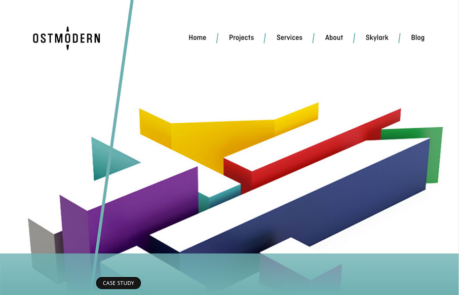
We’re not Arsenal fans here at the house, but I still like the work of Ostmodern (even their Arsenal site) out of London. Clean and bright, and not overbearing. From the Designer: Hard for me not to be biased as we designed and built this site! Ostmodern are a...