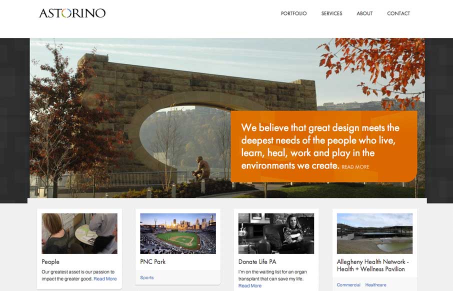
by Gene Crawford | Mar 7, 2014 | Gallery
Great new site launched for Astorino Architects from the mighty Bearded Studio team. I love the clean layout and responsive design decisions made between the different screen widths. There’s a good bit to study and apply from this sit to all of our projects....
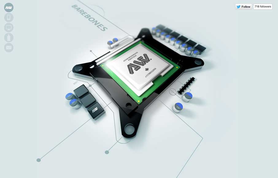
by Giovanni DiFeterici | Mar 6, 2014 | Gallery, Portfolio
The Adam Woodhouse website is clearly a design intended to impress with lush, complex animations and a strong graphical sensibility. Not responsive, but beautiful nonetheless. Plus, Bender.
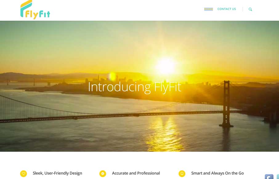
by Aaron Griswold | Mar 5, 2014 | Gallery, Marketing
This is a fast loading video based site that was made for a large screen. It has subtle parallax elements that don’t detract from the main video feature of the site. They could probably go with a cleaner social media linking system, but since it’s a new...
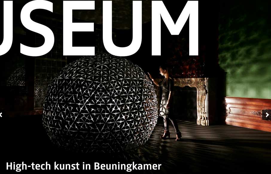
by Gene Crawford | Mar 4, 2014 | Education, Gallery
There is some really neat design stuff going on with this site. I love how the “Rijks Museum” overlays and play with the slider. Then the top nav is just fun to mess with. Nice responsive work here too.

by Maria | Feb 27, 2014 | Gallery
You see these nice responsive sites with their sticky nav and circular images and slick transitions and think, “Yeah, that’s cool, they did everything right.” I’ll be honest, you don’t typically see this much content loaded in and still...