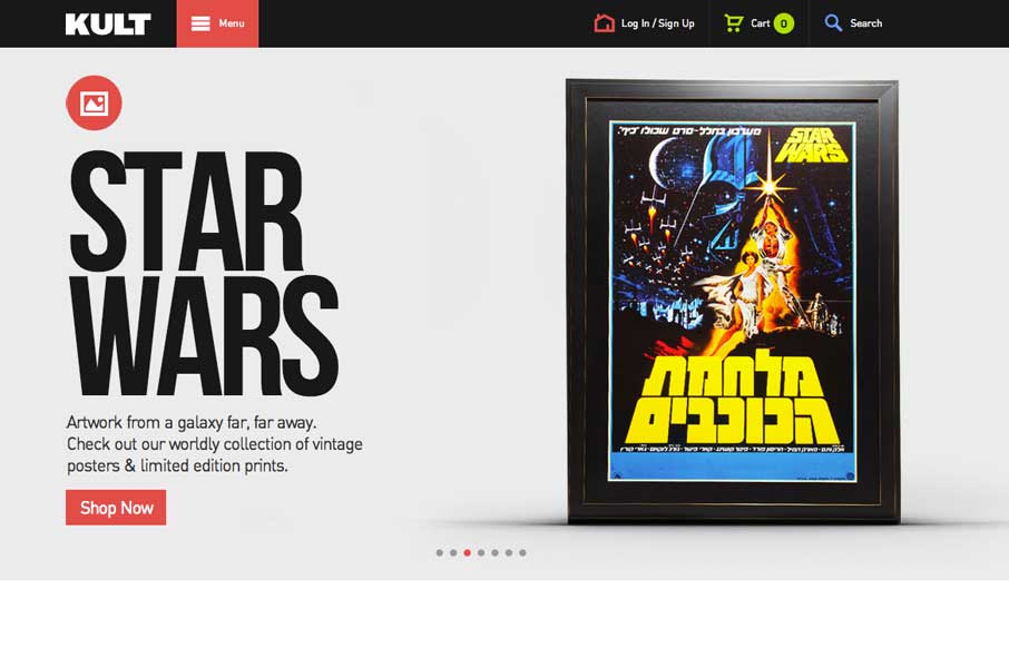
by Gene Crawford | Mar 17, 2014 | Gallery
Good simple layout, just kind of a blocky and bold presentation of stuff. What’s interesting to me is how when you interact with the menu it grays out the content, keeping you focused on the menu navigation itself. What do you guys think of that?
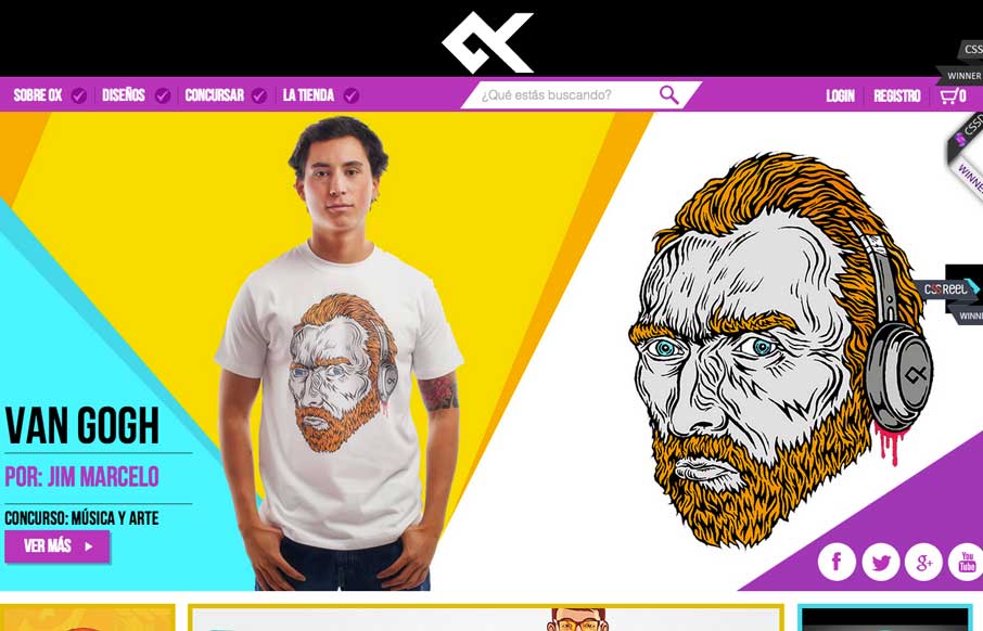
by Gene Crawford | Mar 13, 2014 | Gallery
Great design and vibe throughout this site design. I like the transitions between screen widths too. Loud coloring to help push the products as well as bold previews of the artwork itself.
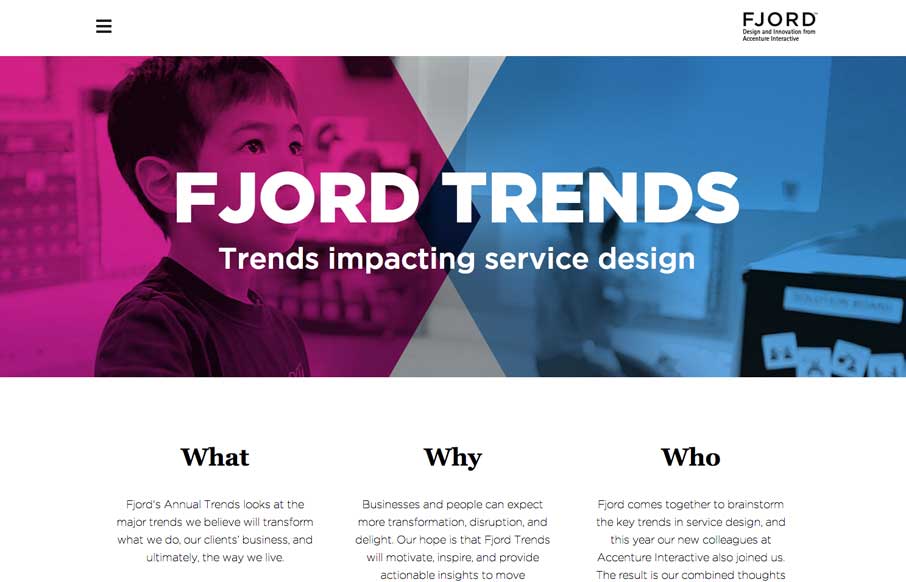
by Gene Crawford | Mar 11, 2014 | Gallery
What a great reading experience the Fjord Trends site turns out to be. Both on the desktop and your mobile device. I love how the stories flow with nice bold blocks of imagery then “fold” out so you can read them right there. The tracking nav on the right...
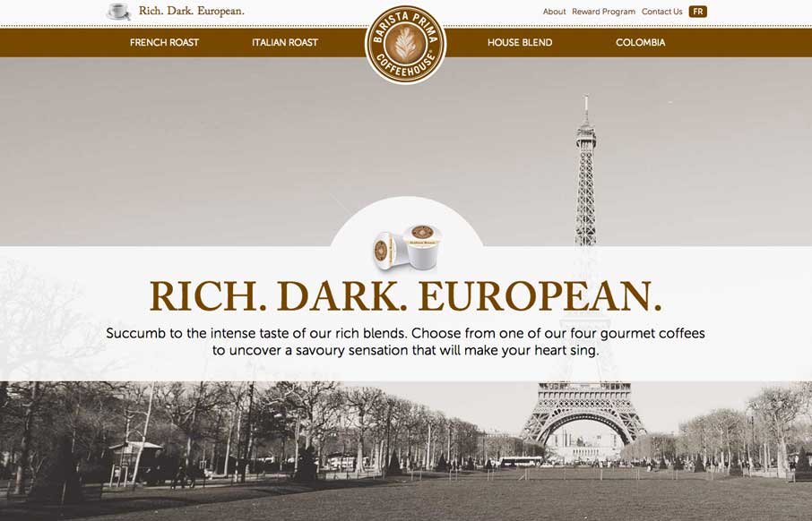
by Aaron Griswold | Mar 11, 2014 | Food and Beverage, Gallery
So… as soon as I saw this site, I fired up the Keurig. The black, white, gray and coffee brown immediately put me in a mood to enjoy coffee. The entire site is centered around the brand’s tagline: “Rich. Dark. European.” The background images,...
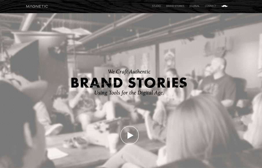
by Gene Crawford | Mar 10, 2014 | Design Firm, Gallery
Really cool looking mix of tight straight edges and hand made type treatments, mixed with the sepia colored imagery. This site has a nice hand made feel but also very high end. The slight movement of the images behind the type overlays add that extra little dimension...