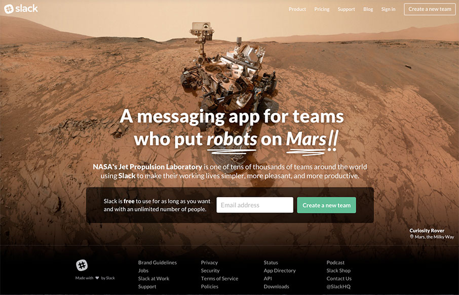
by Aaron Griswold | Feb 1, 2016 | Gallery
Be sure to refresh a few times – very cool images and typography – but we like Slack’s site because it cuts to the chase – the one thing they want you to do here is “Create a New Team” – CTA is key – looking good is...
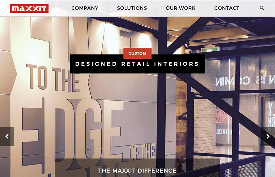
by Gene Crawford | Jan 25, 2016 | Gallery
It’s a pretty standard looking layout, I like most things about it too. What I like most is the 2nd section, the card/block design of the individual project focused part. Strong. The bold read color really helps give things weight too. Submitted by: Jonathan...
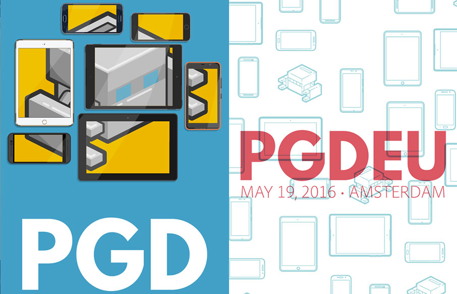
by Gene Crawford | Jan 25, 2016 | Conference, Gallery
Really solid yet simple conference website layout. I really like the big header area with the mobile device illustrations that scroll through/over the PG logo. Then I notice that the entire page scrolls over the logo. Neato! There’s clearly some love and care...
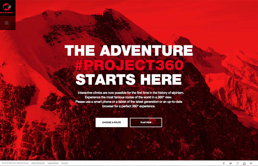
by Aaron Griswold | Jan 21, 2016 | Gallery, Travel
Whoa – just when you think you did well with your video background, then you see the Project360 site from Mammut. Then… the 360 image work all the way up the different mountain routes and the interactive work – incredibly nice.
by Gene Crawford | Jan 20, 2016 | Design Firm, Gallery
This website for the VO2 Group is pretty powerful in it’s imagery and overall interactions. It harkens me back to the days of flash sites pretty hardcore, but I still love it. The interplay from the home page to the longer scrolling project pages are pretty...