Maxxit Systems

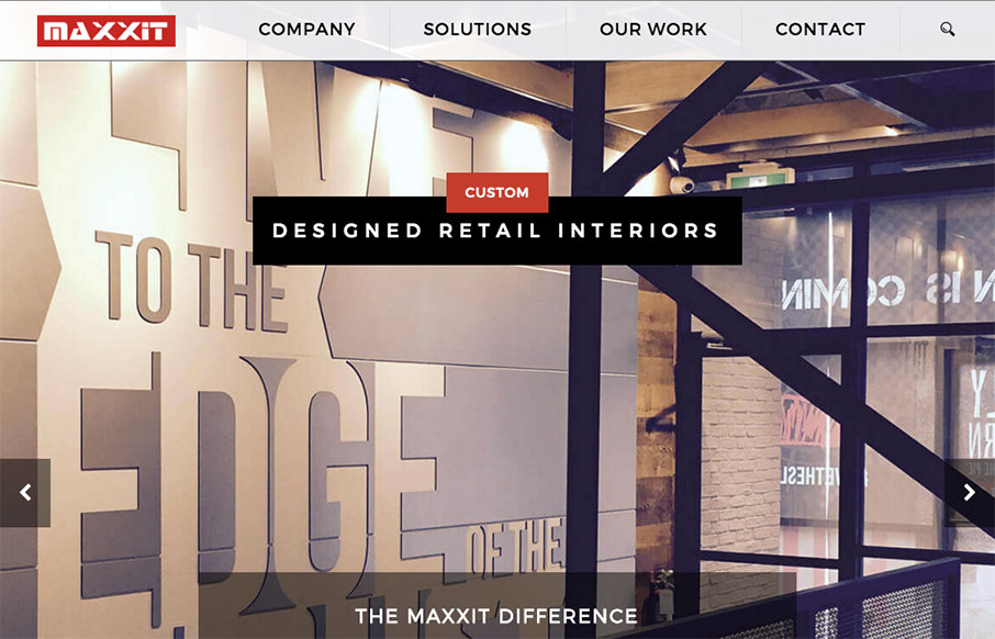
It’s a pretty standard looking layout, I like most things about it too. What I like most is the 2nd section, the card/block design of the individual project focused part. Strong. The bold read color really helps give things weight too.

Submitted by: Jonathan Ryan
Role: Designer
Country: Canada

Author

Gene Crawford

With over a decade of experience in the industry he has overseen the design and architecture of hundreds of web sites and applications. An active member in the design community, he's the editor & producer of unmatchedstyle.com, the ConvergeSE, ConvergeFL, ConvergeRVA and the Breaking Development conference series.