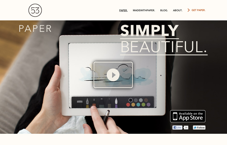
by Gene Crawford | Apr 12, 2012 | Gallery
The Paper app home page is actually a sub page of the FiftyThree website. It’s gorgeously clean and simple though. I absolutely love how the images and copy flow down the page being strongly gridded out but yet almost asymmetrical at the same time.
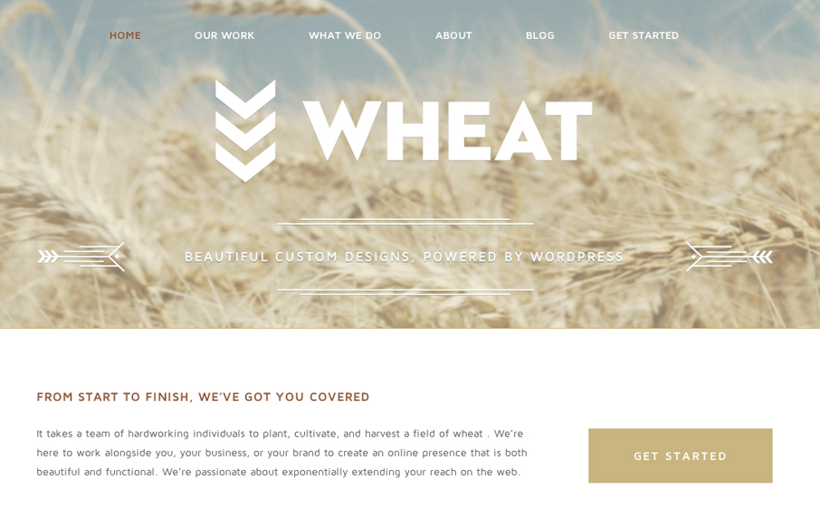
by Gene Crawford | Apr 12, 2012 | Design Firm, Gallery
Just a beautiful design, simple as that. I love the big bold image of the wheat and the large WHEAT set on top of it. Subtle yet not at all. The rest of the site is a display of restraint by the designer, which shows maturity to me. Love it.
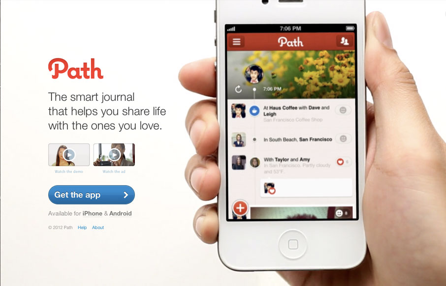
by Gene Crawford | Apr 11, 2012 | Gallery, Screencast Review
The path.com website is a simple/minimal thing of beauty. The background of the site is a demo video that auto-plays in a very unobtrusive way. It’s brilliant really, showing off the app like that – since that’s what will make you fall in love with...
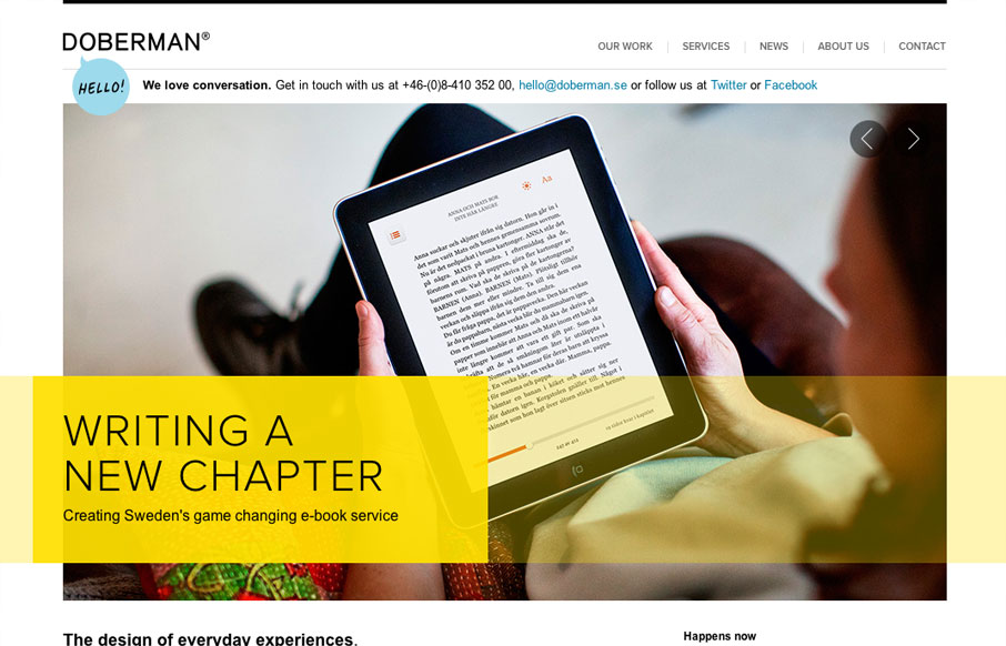
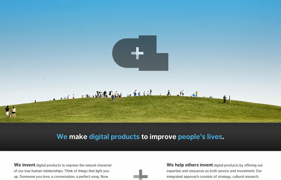
by Gene Crawford | Apr 5, 2012 | Gallery
I really dig the hierarchy designed into this home page. The large image/slideshow is nice with nice details and you get t focus on that, with simple messages and then as you scroll down the info gets more densely populated and then eventually just some basic about...
by Gene Crawford | Mar 28, 2012 | Gallery
The new Crush Lovely website is simple and direct. I really dig how the tone is mainly delivered with copy and such. The “select clients” and “imagined future clients” stuff is pretty smart. The super large contact form with the large text box...