
by Gene Crawford | Jun 21, 2012 | Gallery
I love the super simple direction of the Square App home page. It’s deceptively simple in that there’s one thing they want you to do, signup. But it’s done with a slideshow that loads in different signup options with each type of product and...

by Gene Crawford | Jun 20, 2012 | Gallery, Travel
This is a very thorough responsive design solution. The main navigation changes alone are worth reviewing in some detail. Plus there is just a ton of info/elements on the home page that get handled well through each screen size transition.
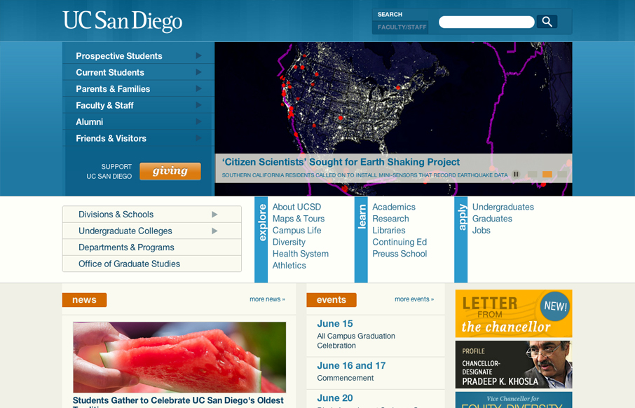
by Gene Crawford | Jun 20, 2012 | Education, Gallery
The UC San Diego website is very modular and square which is softened up a bit by the colors and a few slightly rounded corners here and there. There are a few sections of the home page that fall into a sort of “i’m just tired of designing” sort of...
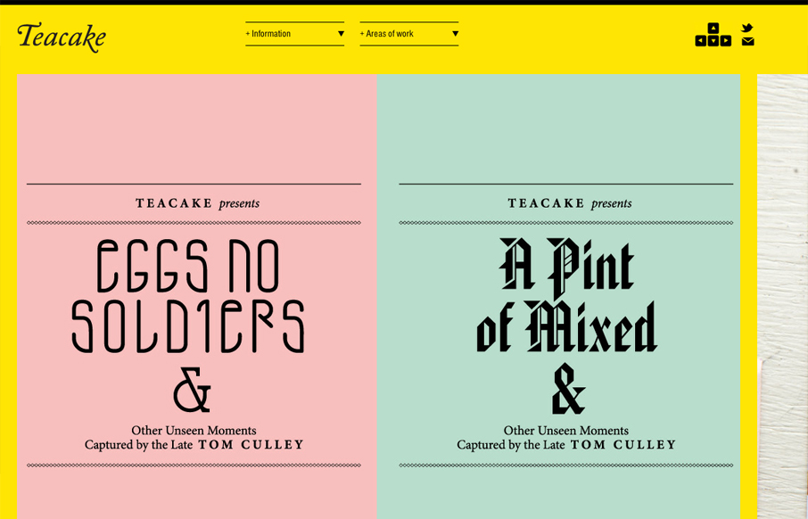
by Giovanni DiFeterici | Jun 20, 2012 | Gallery
I really enjoy teacakedesign.com because, while the layout and design present the work beautifully, the main thrust of the design revolves around making it easy for a visitor to navigate through the work. On teacakedesign.com, I enjoyed the ability to move through the...

by Giovanni DiFeterici | Jun 19, 2012 | Gallery, Portfolio
jeremycowart.com is a great site to show off Jeremy’s work. The homepage is striking in its boldness and gives a direct and immediate view of some of Jeremy’s best work and the rest of the design is bold, minimal and progressive. The use of masonry...