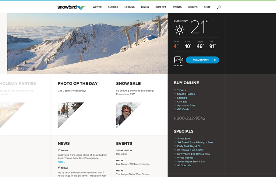
by Gene Crawford | Jan 4, 2013 | Gallery
Well that’s a nice looking’ site. snowbird.com via @alliwagner— Chris Coyier (@chriscoyier) December 11, 2012 Agreed, it’s an amazing experience as you use it. The interactions are spot on and even more it’s fun to use. That’s...
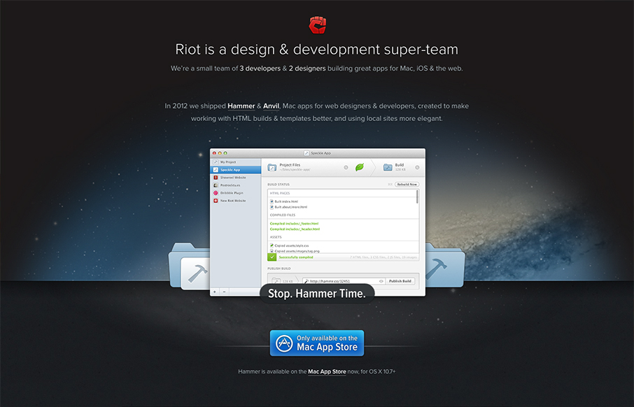
by Gene Crawford | Jan 3, 2013 | Gallery, Software
The crispness of this design just makes me smile. Then the subtle execution of the visual elements from the perfectly chosen color blue for the call to action, to the team display down to the faded map in the footer. There’s so much here visually it’s...
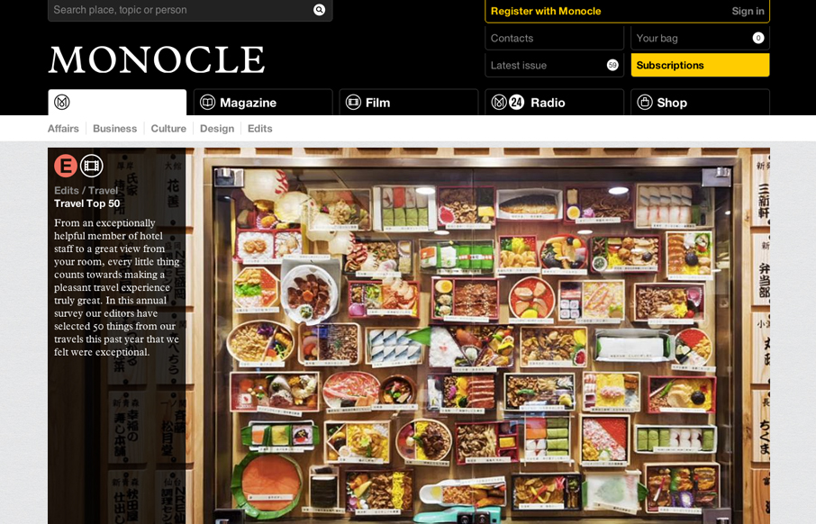
by Gene Crawford | Jan 3, 2013 | Gallery
The new Monocle design is smart and sleekly crisp. I really love the header interaction design. It goes from full height to small and sticky very fluidly. Then the asymmetrical feel to the broken up grid of story blocks as you make your way scrolling down the home...
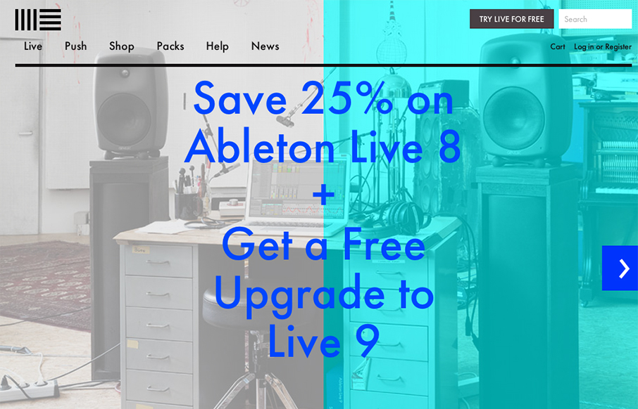
by Gene Crawford | Jan 2, 2013 | Gallery, Music, Software
The product looks pretty awesome and so the website has to continue that same visual brand. Start black and angular type, minimal colors and crisp lines when there are any mark both the physical product and website. I like the way the slideshow loads when you first...

by Gene Crawford | Dec 21, 2012 | Gallery
This design is very crisp and nicely worked out. What I like most is the discreet interactions between scrolling/navigating down the page. The black to red shift in the line & icons keeps you informed and engaged on a visceral level. I just found this design a...