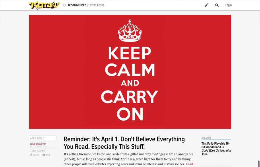
by Jay Barry | Apr 2, 2013 | Blog, Gallery
The new Kotaku site is part of a rollout of a new platform from Gawker. Other sites using the same platform so far include Jalopnik and Deadspin. It’s helpful that they’ve linked to a post about the new look, but it doesn’t give us much insight into...
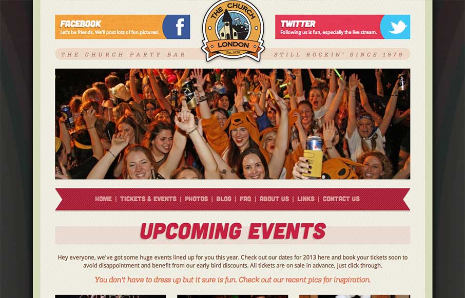
by Gene Crawford | Apr 2, 2013 | Food and Beverage, Gallery
Overall a pretty simple design but it works great here. The mobile approach is a great choice, generally speaking, but for this party bar specifically it’s done right. I like the big twitter and facebook icons across the top of the page, those are going to be...
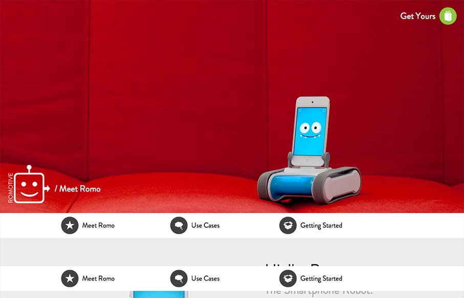
by Gene Crawford | Apr 1, 2013 | Gallery
This website has an interesting story to tell. Meet Romo. It’s a fun and whimsical robot/device and the pages of this website really dig in and give you the narrative of each of the major points of this thing. How it all works, how to buy/sell it and “hey...
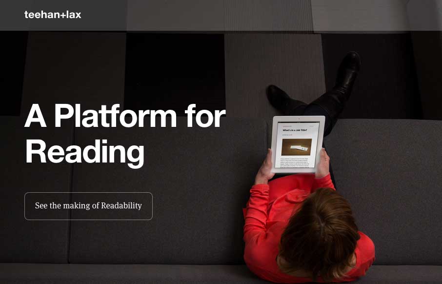
by Gene Crawford | Mar 26, 2013 | Gallery
I love how this site puts just what’s needed out for you to see. Just a single headline at first but then you notice the fixed header and built for mobile navigation design. The entire nav slides down to give you an easy to take in navigation design, just main...
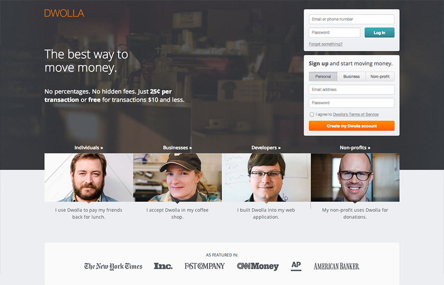
by Gene Crawford | Mar 25, 2013 | Gallery
The Dwolla site design is of good quality and execution. I like the different configuration and stacking of the elements on the page as you scale the page down to smaller screen widths. What I like most of all is the use of negative space between the main/topmost copy...