
by Gene Crawford | Apr 14, 2016 | Gallery
Real real solid product website here. I dig the overall concept of the way the app is presented. Also the detail work of the slight parallax in the bigger hero views really makes the site sing. The app itself looks beautiful and so the website pulling in some of that...
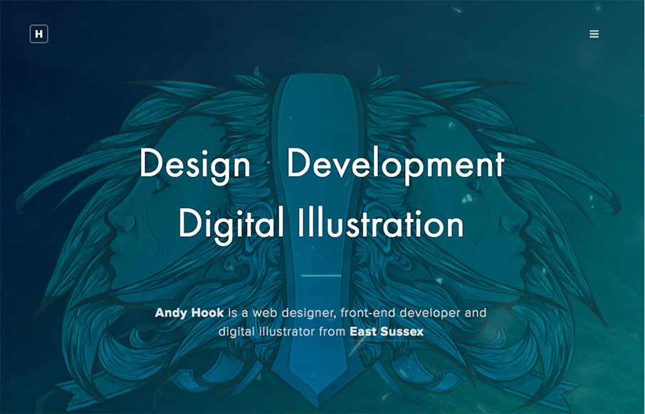
by Aaron Griswold | Apr 13, 2016 | Gallery, Portfolio
Man – another great portfolio site from the UK for Andy Hook. Cool illustrations and great tone to the site. Nice. Submitted by: Andy Hook Twitter: @andy_hook Role: Designer & Developer Country: England

by Aaron Griswold | Apr 13, 2016 | Gallery
Good, clean site out of the Ukraine for Pixons. I like the block design and work on the Projects page especially – good balance with imagery and descriptive text. From the Designer: This is our company brand new website. We build digital products & services....

by Gene Crawford | Apr 6, 2016 | Gallery
Strong graphically. I dig the overall vibe of this website, I extra like the way the two main sections are presented in the “middle” of the home page. I am not a fan of waiting through the loading % bar thing, but I suppose that can’t be helped to a...

by Gene Crawford | Apr 5, 2016 | Gallery
The Sheridan Life life page of the Sheridan website is a super sweet page design buried inside the overall corporate website. It’s beautiful, great typography and great rhythm, I loved discovering this. My favorite interaction points are the header and the page...