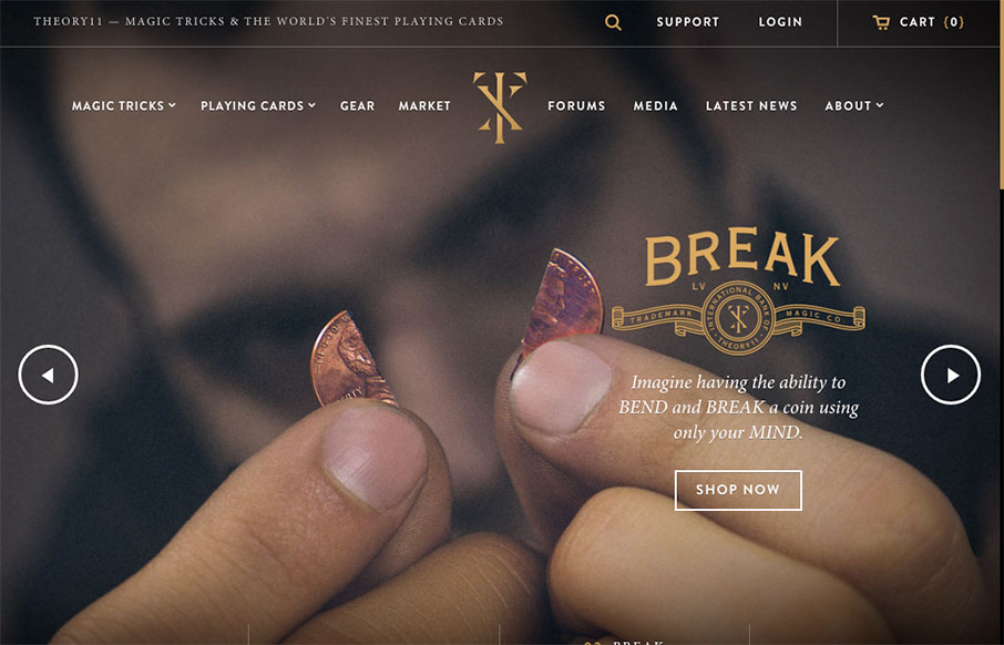
by Aaron Griswold | Apr 4, 2016 | Education, Gallery, Shopping
Love this site from Theory 11. There is so much going on, but it still stays organized (good for shopping) – and has some fun pages too (like the About page). Done by @Forefathers – who has a great site themselves – and looks like it’s a custom...
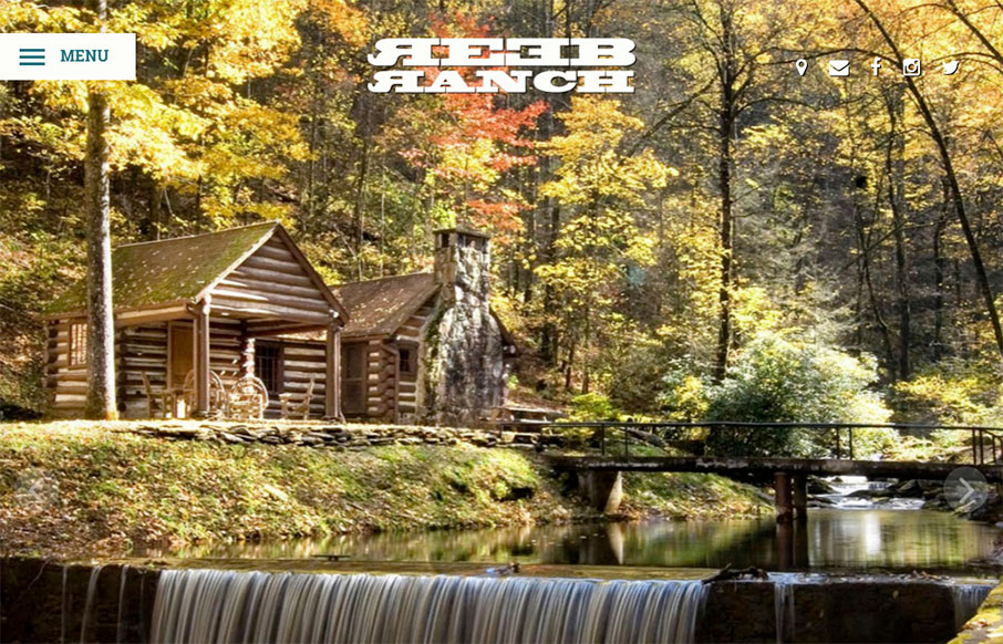
by Aaron Griswold | Apr 4, 2016 | Gallery, Travel
From our friends in Asheville, NC – Open Door Design Studio – is the site for REEB Ranch. It’s clean and vibrant, and really emphasizes the event nature of the facility. More from the Designers below: From the Designer: Born from the love of beers,...
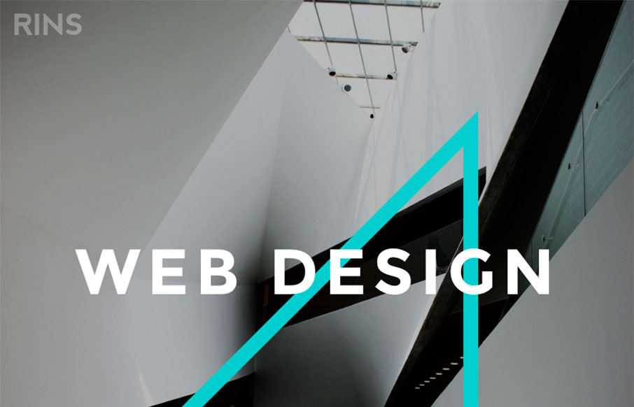
by Gene Crawford | Mar 31, 2016 | Gallery
Amazingly simple website layout with some pretty solid simple design work. I love the photos and the interactions on the letters, it draws you in and makes the simplicity work. From the Designer: We don’t just create beautiful designs but also functional and...
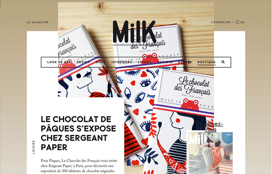
by Gene Crawford | Mar 29, 2016 | Gallery
Slick yet simple approach to the layout for Milk Magazine. I love how the main/top section has some overlapping elements like that, then the nav slides up and locks into place as you scroll down. It all fits together and “feels” very purposeful.

by Gene Crawford | Mar 28, 2016 | Design Firm, Gallery
Very nice splash/hero type layout for the main page on Elespacio. My favorite section is the portfolio though. The way the image/photos are done to really pop off the page like they do. Solid.