
by Gene Crawford | Jun 8, 2016 | Design Firm, Gallery
Pretty great visual vibe here. I love the rhythm the page gives you as you scroll down, you feel like you’re getting the vibe of the company. I love the detail work, it’s straight up and simple, but really layout focused detail work. Bravo.

by Gene Crawford | Jun 2, 2016 | Gallery, Travel
Super simple and probably as minimal as it can get for a site like this. I love the simple placement of the location images and how you can just keep sliding to the right to see more. The search design is pretty sweet too.

by Gene Crawford | May 26, 2016 | Gallery, Portfolio
Pretty innovative layout and approach to this designer’s portfolio. I love the interactive details here. The overall approach is a vivid example of someone truly thinking outside the box. (see what I did there?) No, really, this site design is intriguing and...
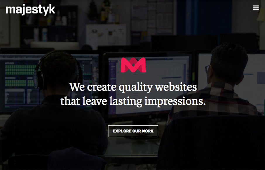
by Gene Crawford | May 24, 2016 | Gallery
Nice use of the fixed images in the background as you scroll. I like the reveal and the layout is even a bit surprising as you make your way down the page. I dig the dark background and hero area stuff too. Nice work. We are a team of passionate and innovative...

by Gene Crawford | May 24, 2016 | Gallery
Shoot, I like this site, a lot. I dig the tall rectangle project sections. It’s such a simple change from the standard stuff we see all the time. But, dang is it effective. I’ll remember that for a long while. Very nice! I’ve redesigned my website (...