
by Gene Crawford | May 24, 2016 | Gallery
Whew. I loved making my way all the way to the bottom of this home page. The way the copy plays with the headlines and sections is brilliant. I love it. I also really dig the overall design. Colors, layout, etc… for each section, it changes up enough to show...
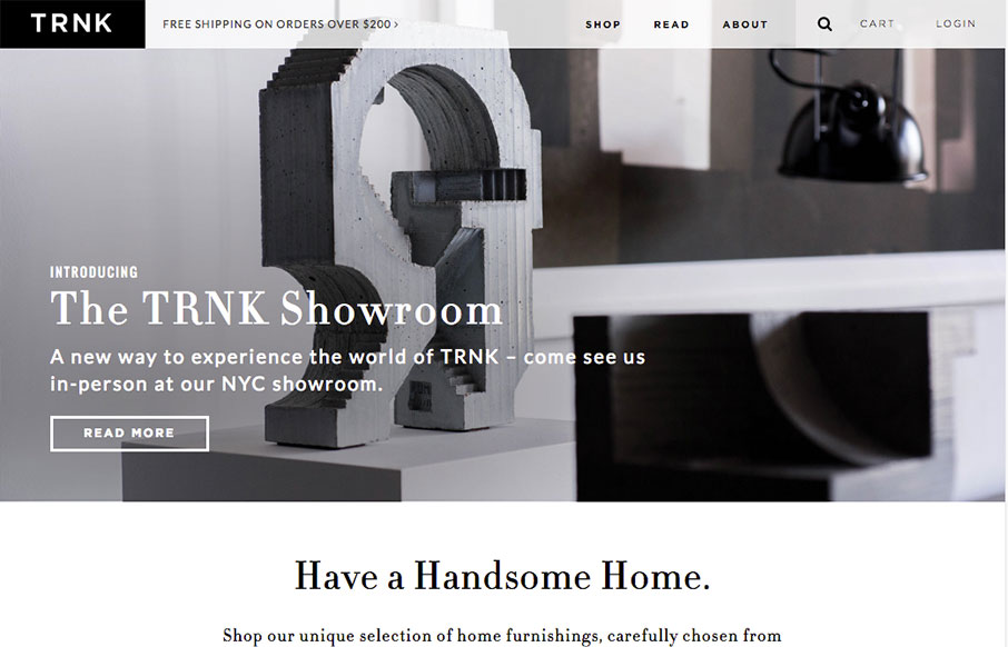
by Gene Crawford | May 23, 2016 | Gallery, Shopping
Very nice grid based layout and a design that takes advantage of that grid and escapes it for good impact lower down on the page. I love the main nav and how it fills in with the overall grid beautifully, with that mega-drop-down design. Solid work here.
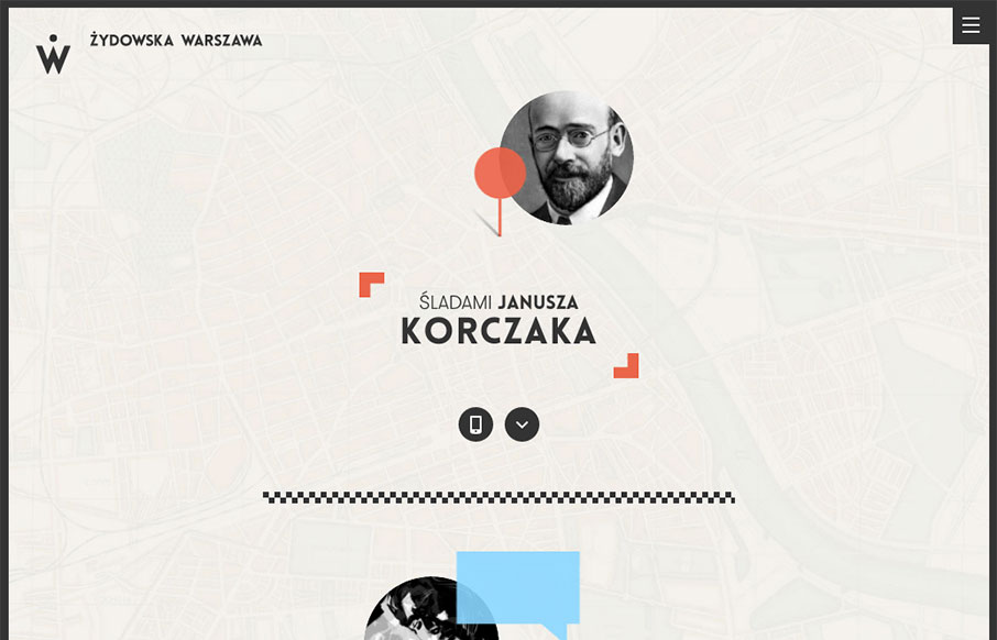
by Gene Crawford | May 18, 2016 | Education, Gallery
Really great mix of illustration and interactive work. It’s a fairly fixed design but it’s fun even if I don’t read Polish. The menu design is also pretty clever too, with the little back arrow worked on there.

by Gene Crawford | May 17, 2016 | Gallery, Travel
I like how this design feels very open. The interactive parts are sort of placed on top of the imagery to make it feel like it’s floating there. There is also a play between the back and forward arrows and the entire, oversized, image changing out too. Cool...

by Gene Crawford | May 16, 2016 | Gallery
Nice solid branding and colors. I love the main nav interaction too, the little details really make it work for me here.