by Gene Crawford | Jul 8, 2013 | Email Newsletter, Gallery
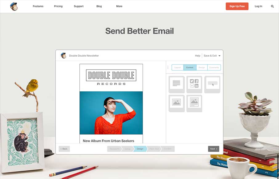
The new Mailchimp site is superb to say the least. The simplified layout on the homepage really sets the tone for the rest of the design. Incorporating the video of how the app works into the homepage like this is smart and works very seamlessly, you almost...
by Giovanni DiFeterici | Jun 13, 2013 | Gallery
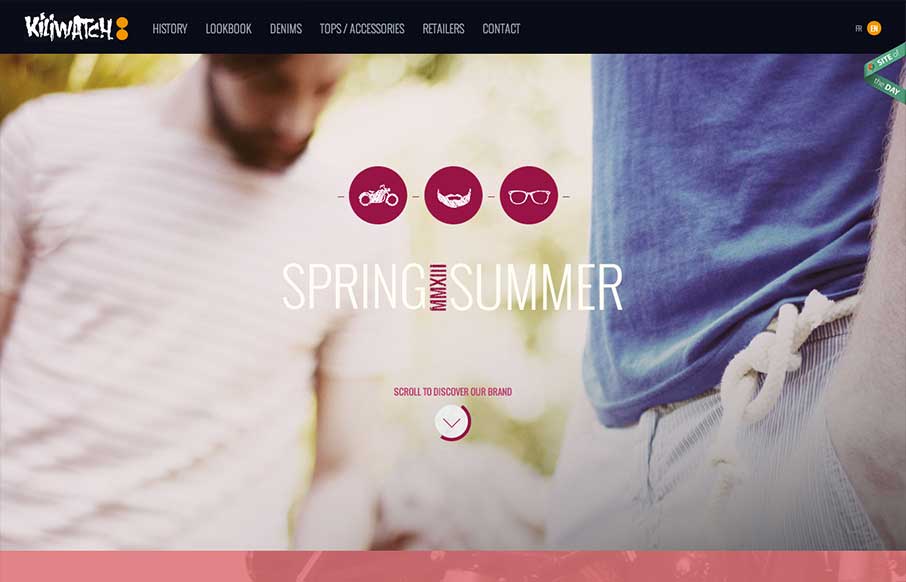
Yet another beautiful product site, strongly driven via amazing photography. Can’t say enough about how beautiful I find the mix of colors, imagery and typography. I’m a little worried about all of the loading screens we’ve been seeing lately, but...
by Gene Crawford | Jun 12, 2013 | Gallery, Screencast Review
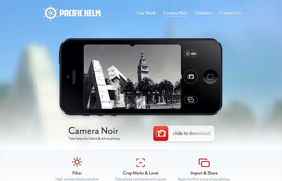
Great touch here… The background and the shot in the camera are the same: pacifichelm.com/cameranoir (via @uptonic)— Jason Fried (@jasonfried) June 4, 2013 I like the idea of this page design, use elements of the photos from the iPhone display of the app in the...
by Gene Crawford | Jun 11, 2013 | Gallery
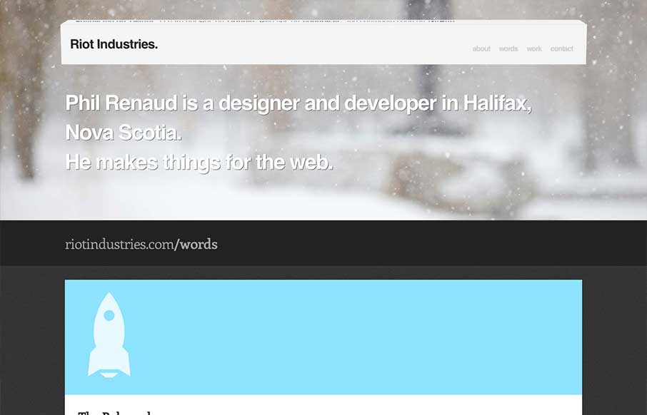
Some really nice fun subtle design stuff in the header of this site: riotindustries.com— Chris Coyier (@chriscoyier) June 4, 2013 I couldn’t agree more with Chris. The header is a beautiful example of adding a dimension of animation/interactivity and not...
by Gene Crawford | May 28, 2013 | Gallery
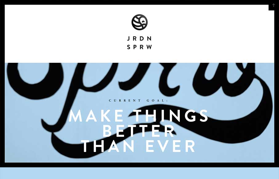
I love the Jordan Sparrow site design. The black frame and the stark lines really play well off the background video which is set in place as you scroll down. The bold lines in the design and type match up perfectly to give me something to remember the site by days...
