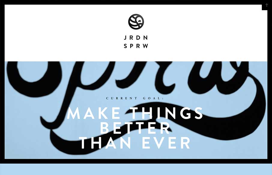
by Gene Crawford | May 28, 2013 | Gallery
I love the Jordan Sparrow site design. The black frame and the stark lines really play well off the background video which is set in place as you scroll down. The bold lines in the design and type match up perfectly to give me something to remember the site by days...

by Gene Crawford | May 23, 2013 | Gallery, Portfolio
I’m seeing a few new design trends like this one, where there’s basically a splash page but it’s executed as an oversized header area. Pretty clever, like this one, which reminds me of a cylon’s eye for some reason. That alone is enough to make...
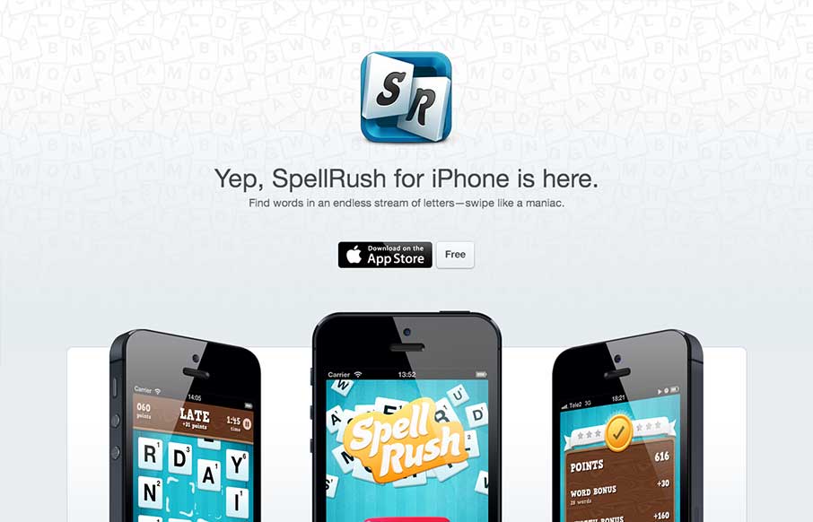
by Giovanni DiFeterici | May 17, 2013 | Gallery
I’ve always liked well executed microsites. This one has a very Apple appeal, which makes sense. They are selling to a specific platform. Everything is clean but tight. The site is a good billboard/magazine ad. It presents the product beautifully, it sells the...
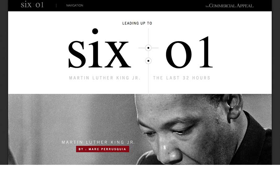
by Giovanni DiFeterici | May 16, 2013 | Education, Gallery
This is about as beautiful a timeline as I’ve ever seen. The content is presented clearly and concisely. It’s linear presentation is perfect for telling a story and the mix of images, video, and text creates a rhythm that punctuates the high points of...

by Giovanni DiFeterici | May 15, 2013 | Gallery
Hopskoch is joyful and simple. It’s subtle animations are perfectly appropriate for selling the brand and pair nicely with the easter color palette. I really dig how the main product image scrolls up a little and fades out as you scroll down the page and the...