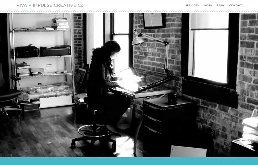
by Gene Crawford | Apr 17, 2014 | Gallery
Here’s a similar visual formula for a layout but there’s a slight difference to this site with the light line work and icon designs. I dig it.
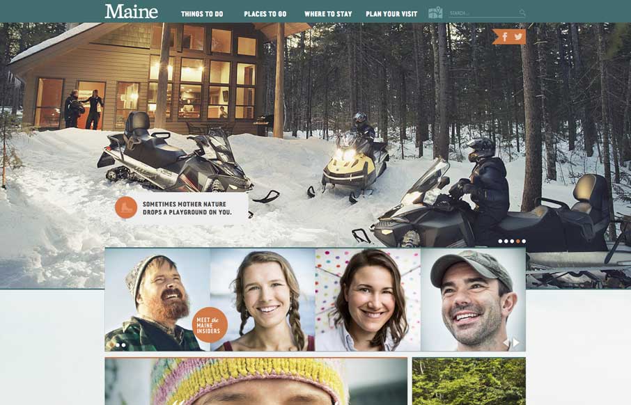
by Gene Crawford | Apr 16, 2014 | Gallery
So i’m planning a trip to Maine this summer, I came across this website for Visit Maine and it’s a nice one. Good responsive approach and beautiful design. I love the navigation design a great deal on this site.
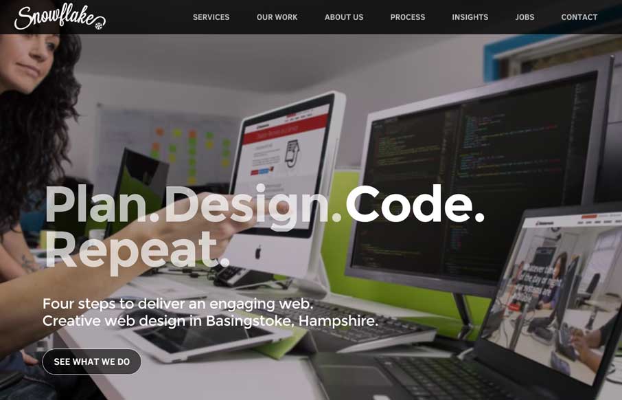
by Aaron Griswold | Apr 15, 2014 | Gallery
Oooh! I love the way the background images in the hero area(s) of this page get some faux 3d movement. That’s very smart and I don’t think i’ve seen that before. What a way to make the site different than the rest. Bravo.

by Aaron Griswold | Apr 15, 2014 | Gallery
Little details make the site. I like the little movement the down arrow has, just to let you know it’s there. Then the little paper airplane on the contact button is nice.

by Aaron Griswold | Apr 14, 2014 | Gallery
Nice minimal approach to the HARBR Co site design. I like the “menu” link and how that interaction works. It helps to keep the site clean and focused.