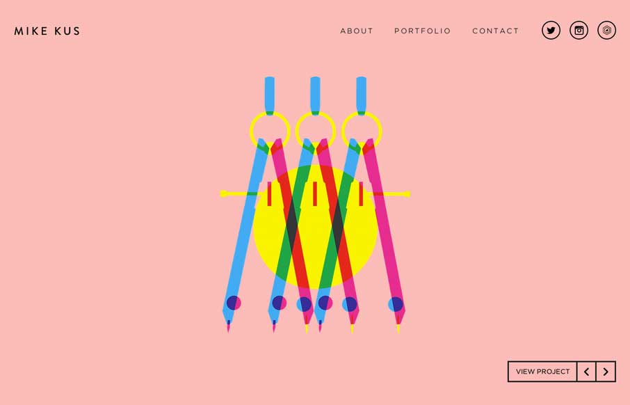
by Aaron Griswold | Apr 11, 2014 | Gallery
There’s nothing quite like a simple beautifully designed website. Mike Kus nailed it.
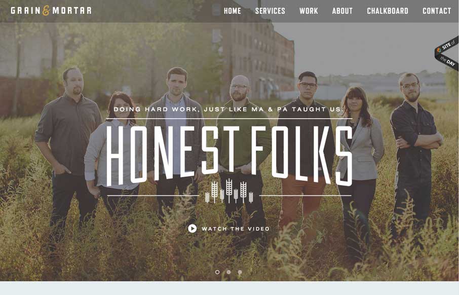
by Aaron Griswold | Apr 11, 2014 | Gallery
Beautifully designed website here for Grain and Mortar. I love the dark overtone to the design and love the typography. There are some really wonderful illustrations throughout the website too – if you’re into that sort of thing 🙂
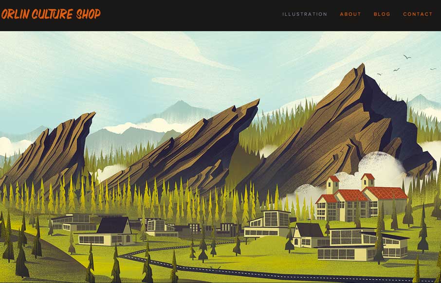
by Gene Crawford | Apr 10, 2014 | Gallery
Super simple and elegant way to show off your work for an illustrator. I get to just sit here and scroll down the page and take in all this succulent work. Mmmm.
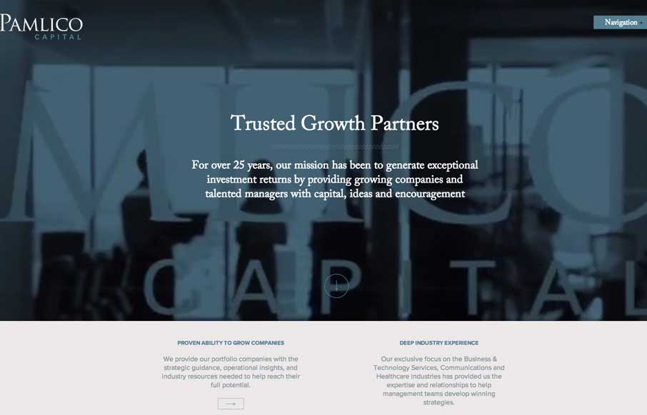
by Aaron Griswold | Apr 10, 2014 | Gallery
I like the use of the video in the header on the Pamlico Capital site. All of the slider interactions across the home page are nicely done too, they’re subtle enough and effective at the same time. I don’t think i’ve seen a site’s navigation...
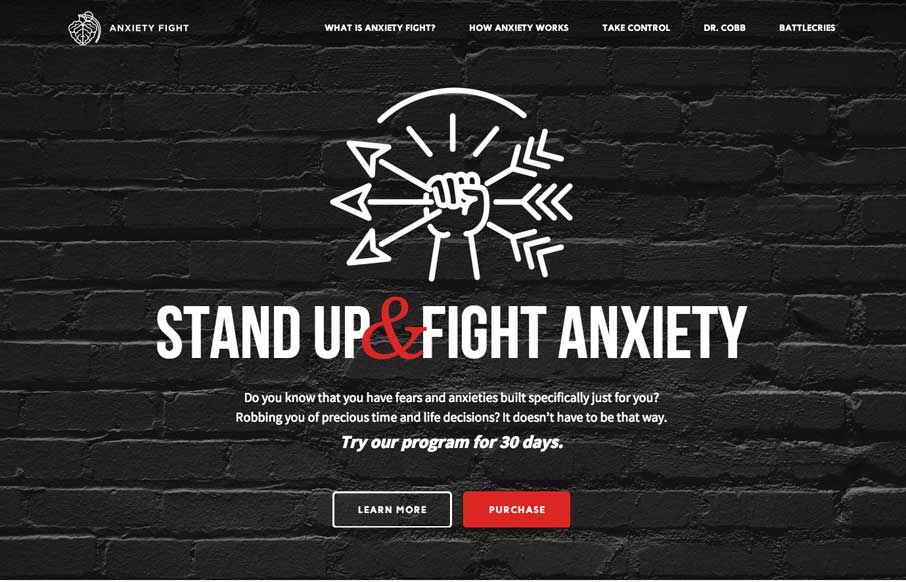
by Gene Crawford | Apr 8, 2014 | Gallery, Medical
Strong visual language backs up a nice solid design and layout. Sometimes you can see there’s good content that the designer has to work on, this site is a good example of that. Good content backed up with good design.