
by Gene Crawford | Oct 23, 2014 | Gallery
Loose visual style and stark graphic type and colors make up a site aimed at young people to signup for service. It’s a smart design in many ways but the strongest part is it’s mobile friendly enough to get the right audience looking at it. Submitted By:...
by Gene Crawford | Oct 23, 2014 | Gallery
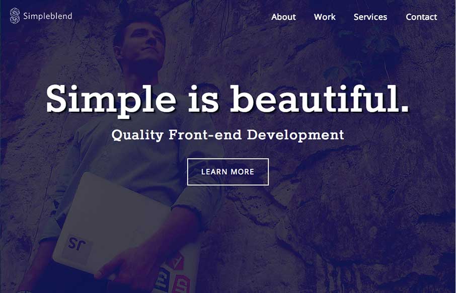
Pretty much standard fare when it comes to design patterns of a portfolio site. However, the soft feel of the colors and design work and some details in the interactions, like the work samples section make this site work well enough for me to keep digging into the...

by Gene Crawford | Oct 20, 2014 | Gallery
Really cool usage of transparency across sections of the layout here. I really dig how that header’s background fades into white then back out as you scroll back up. Smart details make this site really stand out to me. Submitted by: Marc Hinse @MadeMyDay Role:...

by Gene Crawford | Oct 15, 2014 | Gallery
I love a lot of the detail work in the different visual sections of this site. The way things are stacked and lined up is pretty tight and while very similar to other website’s feels a little different somehow. Submitted by: Álvaro Castaño @cronnection Role:...
by Gene Crawford | Oct 9, 2014 | Gallery, Sports/Recreation
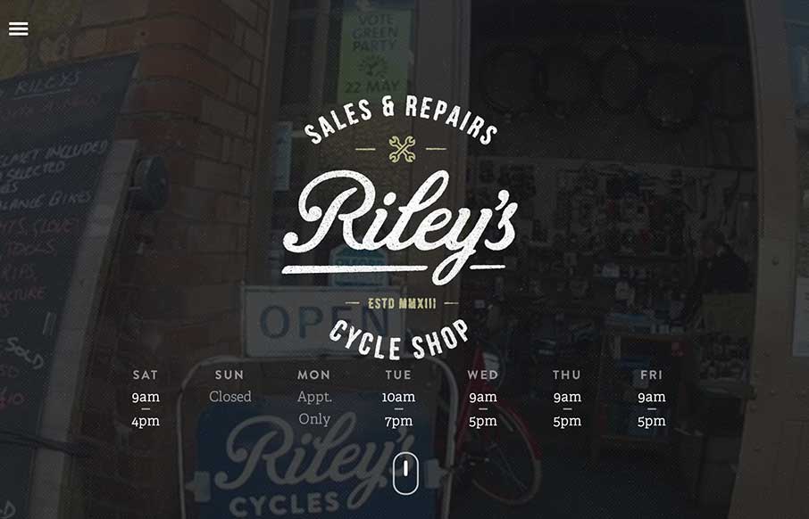
Beautiful site design. I love the video image in the background of the main hero area. The little scroll graphic using the mouse and the length of the scroll wheel is smart too.