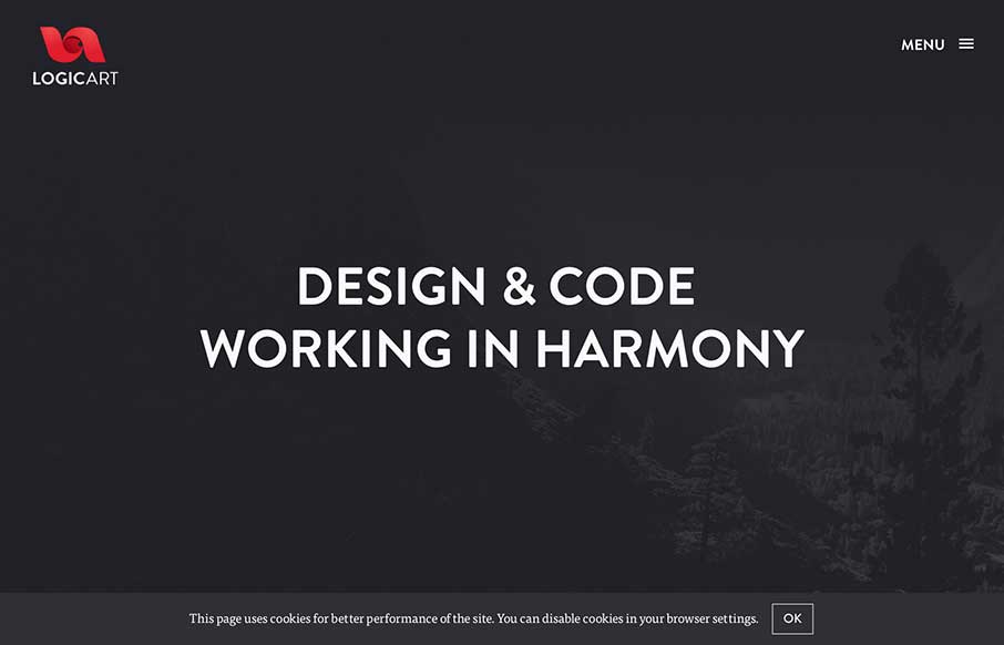
by Aaron Griswold | Oct 8, 2014 | Gallery
I really like how this site flows. The scrolling of the subtle parallax and the reveals is very smooth. The muting of colors helps accent the portfolio and the designers themselves. Submitted by: Monika Majkowska @logicartpl Role: Designer Logicart is a small creative...

by Aaron Griswold | Oct 7, 2014 | Gallery
“Live Free or Dang (and Blast)” – ok, living in New Hampshire for six years, I saw a joke there… just sorry it was a bad joke… But Dang and Blast’s agency site is neither of those. It’s a good, clean site that is modern,...
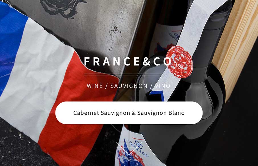
by Gene Crawford | Oct 6, 2014 | Food and Beverage, Gallery
Looks like a simple site – but some nice background image, slight parallax feel in the scroll. A little confused on the copy translation and repeats, and the social icons that go nowhere. But the design itself is vibrant, and seems to get the brand’s image...

by Gene Crawford | Oct 2, 2014 | Gallery
I like a lot about this website. It’s simple, single page, minimal color palette. But it communicates what they do and has some bells and whistles to show off to potential clients. Submitted by: Pedro Thomaz @PTthe13 Role: Designer Clean and modern single page...
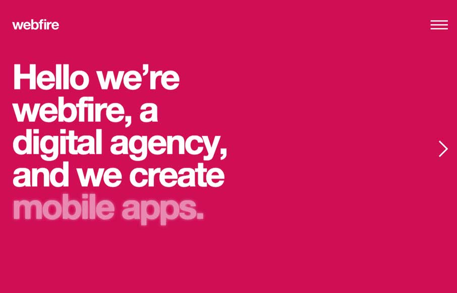
by Gene Crawford | Sep 25, 2014 | Gallery
Nice easy way to deliver a message. I can’t help but reminisce about splash pages when I see site’s that utilize big entry overlay designs like this. Submitted by: Gareth Evans @webfireagency Role: Project Manager We’ve tried to do something...