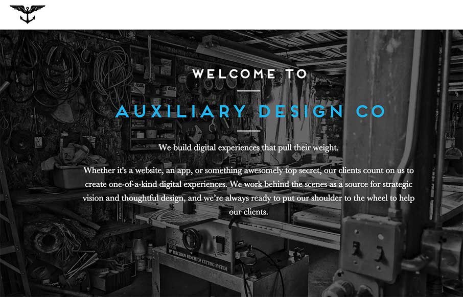
by Aaron Griswold | Nov 5, 2014 | Design Firm, Gallery
This is the website for Brooklyn-based Auxiliary Design Company. It uses lots of subtle (and sometimes not-so-subtle) interactions that give it a unique feel. It’s a responsive site that actually all lives on a single page, although it definitely doesn’t...
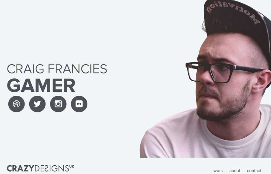
by Gene Crawford | Nov 3, 2014 | Gallery, Portfolio
It’s a simple website but it has tons of personality, just by the photo and portfolio images. It looks well curated. I do also like the way the big portrait photo gets folded out to the right as you minimize the screen to the smaller widths. Very well thought...
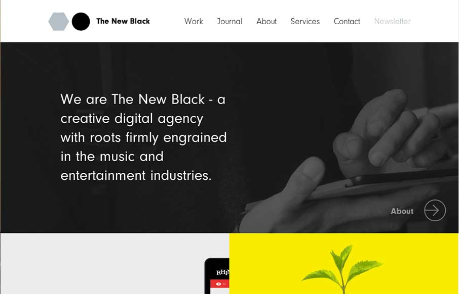
by Gene Crawford | Oct 30, 2014 | Gallery
I love the design for The New Black a lot. It’s traditional in the way it uses the horizontal header bar, but very much not so in the way it’s blocked out and uses interaction to get you involved in mousing around the page. Awesome stuff, done simply....
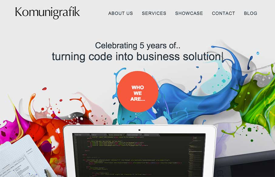
by Gene Crawford | Oct 28, 2014 | Gallery
Pretty crazy navigation interactions on the Komunigrafik site. I’m not sure how I feel about it, what about you guys?
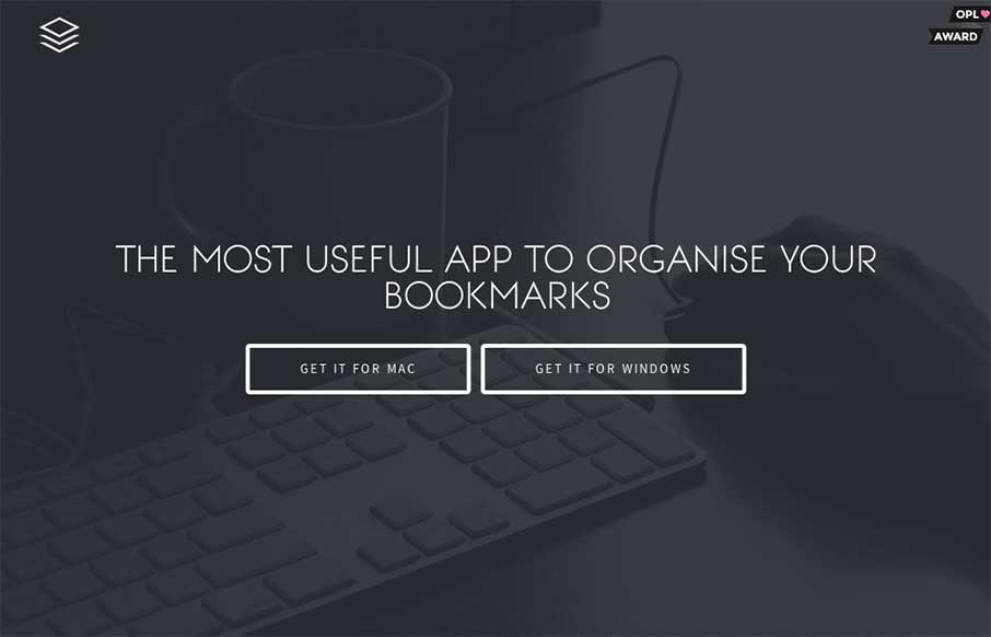
by Gene Crawford | Oct 27, 2014 | Gallery
Nice dark design. You don’t see too many sites done using dark background this well. I also really like the main/hero image of the app screenshot and how it lifts up and loads more into view when you mouse over it.