
by Gene Crawford | Sep 18, 2023 | Design Firm, Gallery
Magnet Co’s website is modern and functional, with meaningful illustrations and a focus on SEO friendly content.
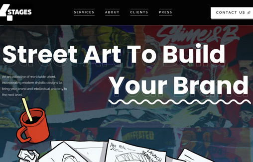
by Gene Crawford | Sep 14, 2023 | Gallery, Portfolio
An art collective of worldwide talent, incorporating modern stylistic designs. Based in Malaysia and Singapore.

by Gene Crawford | Aug 29, 2023 | Design Firm, Gallery
SVZ Design showcases its mastery by aligning the agency’s processes and brand identity with elegantly animated motifs, seamless transitions, and captivating visuals. This meticulous approach not only delights the user’s eye but also serves as a testament...
by Gene Crawford | Aug 23, 2023 | Design Firm, Gallery
I like the feel of this design. It feels kinda like a toy or plastic somehow. Nice illustrations and layout too.

by Gene Crawford | Aug 17, 2023 | Design Firm, Gallery, Marketing, Product
At Fulcrum, we decided to design a roadmap on how to build up scalable and predictable MVP without extra time & money expenses. We called it MVP Assembly Line. Behind its concept – to make MVP development as predictable and fixed as the conveyor belt in your...