by Gene Crawford | Apr 27, 2017 | Design Firm, Gallery
Pretty dang crazy website. I kinda dig it though. It’s highly confusing form a standard set of expectations, but it ends up working just fine. I actually called someone over to my desk and asked them to figure out how to do something on the site and they did no...

by Gene Crawford | Apr 25, 2017 | Gallery
The new(ish) ClearLeft website is live. What a cool yet simple approach. I love it. There’s some real beauty here in their approach. I particularly love the team page and the events page. Read Jeremy’s Launch Note too.

by Gene Crawford | Feb 14, 2017 | Gallery
Good lord I love the Stripe website. Everything about it. It’s so visually dense with content and stuff but yet feels so light and airy. Yeah, I just said light and airy. 🙂 Seriously, you’ve probably spent most of your time with Stripe in the app or on...

by Gene Crawford | Feb 13, 2017 | Gallery
Putting this in the gallery because I love the illustration work. The line work is cool and it’s inviting. The way the’ve weaved in the illustration with the rest of the page design is stellar work too.

by Gene Crawford | Oct 26, 2016 | Gallery, Portfolio
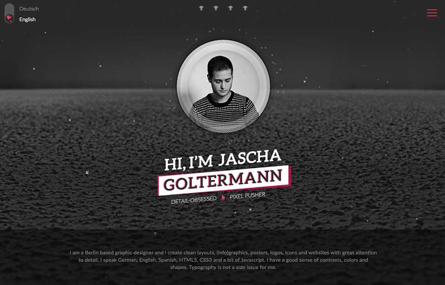
Wow. That’s about all that goes through my mind as I check this page out for the first time. What great CSS animation work on the main photo area. Solid layout and detail work. Hire this man! From the Designer: I am a Berlin based graphic designer and I create...
