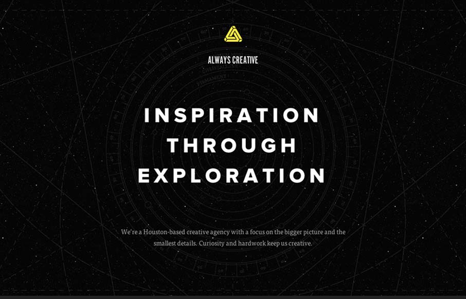
by Giovanni DiFeterici | Sep 10, 2012 | Design Firm, Gallery, Screencast Review
This site is beautifully wide open, with subtle animations and a complex mix of textures. It is somewhat narrative through a combination copy about exploration and imagery of space. Their vision is simply stated, which I like, and the design is super-clean (which I...

by Giovanni DiFeterici | Sep 7, 2012 | Food and Beverage, Gallery
I usually hate when websites hit me with a ‘site soundtrack’, but in this case I really think it helps to complete the experience. The colors, texture, and typography go really well with the music. It took me a little while to realize that the center...
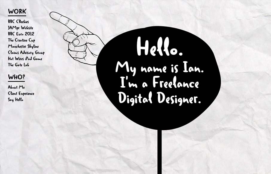
by Giovanni DiFeterici | Sep 6, 2012 | Gallery
Ian put together a nice post for us about his thought process while building this site. I love the experimental feel of the design, so I thought I’d throw it in the gallery. As Ian mentioned, this site certainly makes accessibility sacrifices to accomplish the...
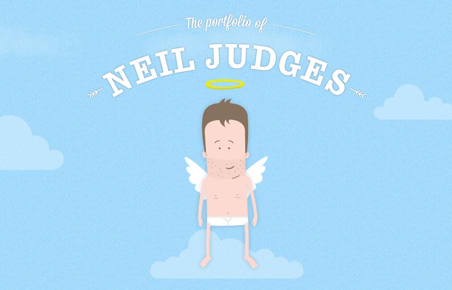
by Giovanni DiFeterici | Sep 5, 2012 | Gallery, Screencast Review
Damn, this site is fun! It’s all about animation and storytelling, both of which it handles beautifully. Here’s a case where the art is the content. It shows how clever Neil can be, as well as his skill set. One of my favorite personal sites to date....

by Gene Crawford | Sep 4, 2012 | Education, Gallery
Really tight design for the Treehouse website. I love the main graphic with the interactions that make the other elements on the illustration disappear. They work really well to pull you in deeper into the chosen section. I equally like the fixed header and how...
