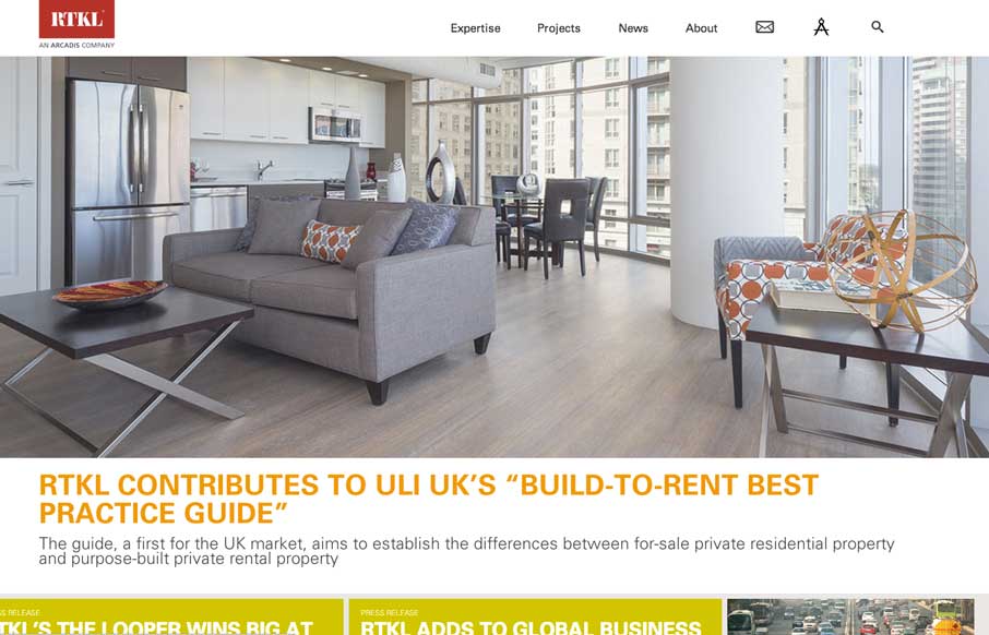
by Gene Crawford | May 1, 2014 | Gallery
Beautiful and simple approach to this site’s layout. Cool use of the Masonry like layout below the hero image area too – actually putting it to work via the content too.

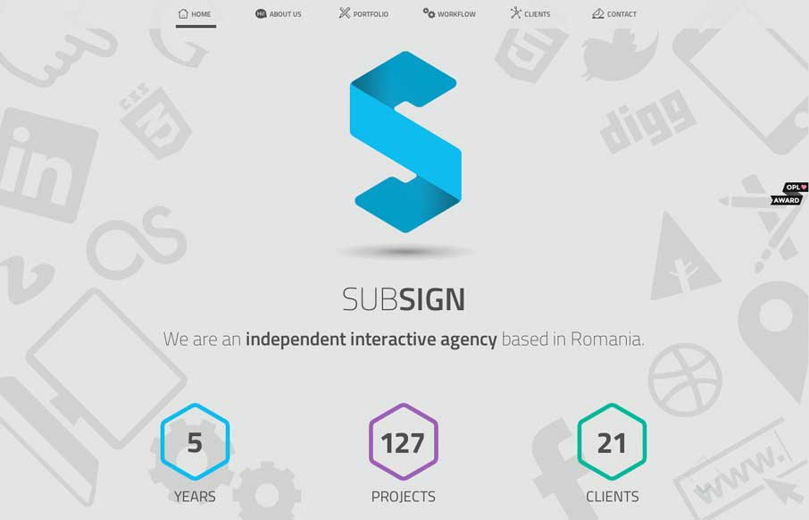
by Gene Crawford | May 1, 2014 | Gallery
Cool vibe to this site. I like using it. The use of the “hamburger” icon to show the names of the pages/sections instead of only relying on the icons is a good idea. I love the yellow and black with the B&W imagery to boot.
by Aaron Griswold | Apr 30, 2014 | Gallery
As one-page websites become more prevalent, you start looking at them a little differently than when they first started popping up onto the interwebs. I like how clean and minimal the site is which makes it quicker to get to the information they think is important to...
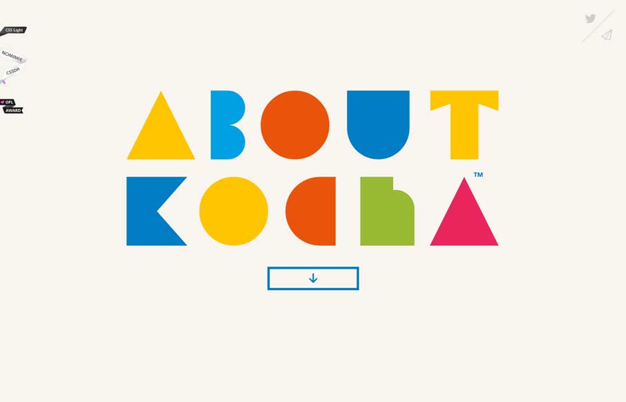
by Gene Crawford | Apr 29, 2014 | Gallery, Portfolio
Damn I love this website. Just beautiful illustrations supported by a clean design base.
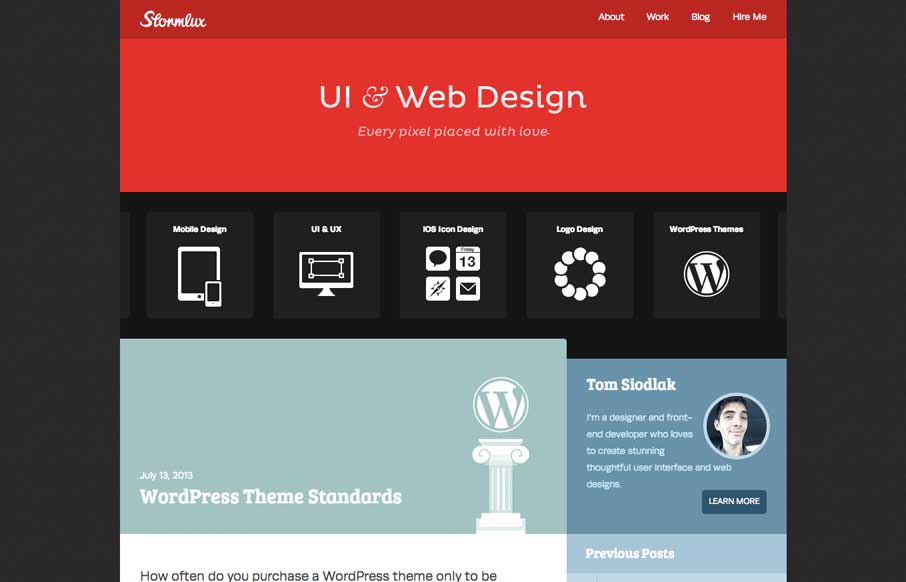
by Gene Crawford | Apr 29, 2014 | Gallery
Clever looking design to this website. It wins me over quickly just by feeling unique. I like the way the icons are used to show the core services and with a little explanation. Good work!