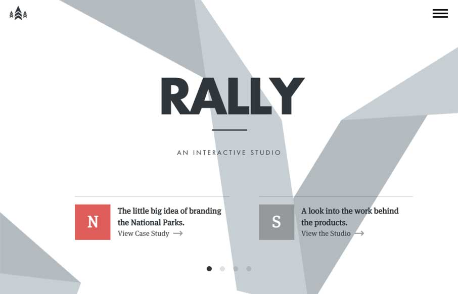
by Gene Crawford | Feb 3, 2015 | Gallery
I love just about everything there is about the Rally website. The main “hero” area, not sure what to call this area anymore really, is super dope. The “ribbon” graphic is very nicely executed, even when you scale the screen down the ribbon...

by Aaron Griswold | Feb 2, 2015 | Gallery, Software
I like how Writizmo went with their main content in the hero area. The marketing messages / feature lists that a lot of web apps use are normally in a long scroll below the fold, or in a rotating barrage / slideshow that no one really looks at…( just...
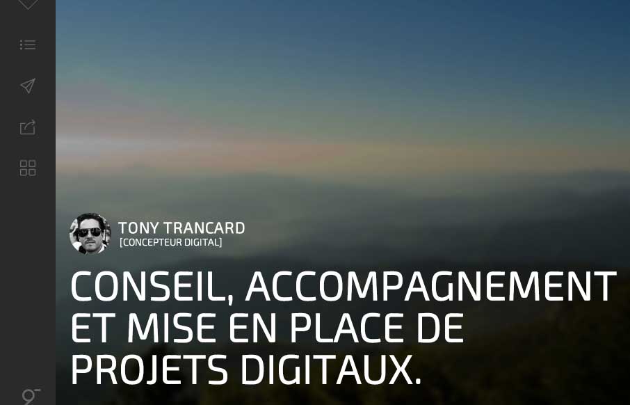
by Aaron Griswold | Feb 2, 2015 | Gallery, Portfolio
It took me a minute to get into Tony Trancard’s portfolio site (out of France), because it was a little deceiving at first. The large image with the mostly text and gray below threw me off. But then I remembered that there was vertical navigation, and anyone...

by Aaron Griswold | Jan 29, 2015 | Gallery, Portfolio
Good portfolio site from Paul VL out of Greece. Like the large fonts with white type on a different color palette than everyone else is using right now. Wish the work detail pieces were more than just a pop-up so you could see a little more of the quality of his work...

by Aaron Griswold | Jan 28, 2015 | Gallery
Man that site is shiny, and twinkly. I like how Kurzik, out of the Ukraine has amped up the look and feel of their site with dark backgrounds and bright highlights. And I swear the video background is responding to me / my mouse – I know it’s not.. but...