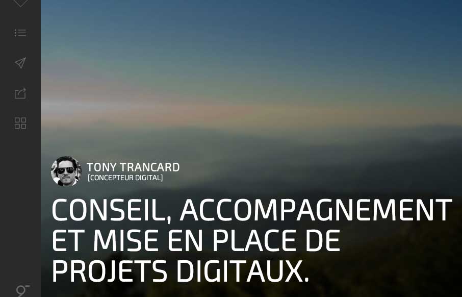
It took me a minute to get into Tony Trancard’s portfolio site (out of France), because it was a little deceiving at first. The large image with the mostly text and gray below threw me off. But then I remembered that there was vertical navigation, and anyone that uses vertical navigation on their portfolio site is willing to be a little more experimental than other designers. I like how Tony has changed up how some of the nav and scroll works on the side – the motion, the up/down/left/right scrolling – to the overt and bold “share my work on Twitter” – it all makes sense now – keep your clients happy with great, solid work – and have some fun with your own stuff.
Submitted by: Tony Trancard
Role: Designer & Developer
Twitter: @tonytrancard


0 Comments