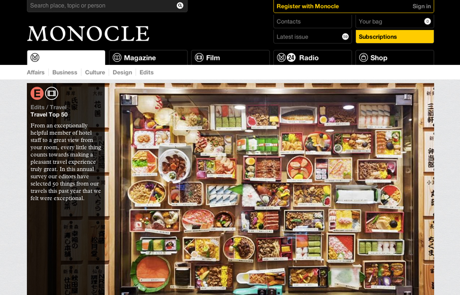
by Gene Crawford | Jan 3, 2013 | Gallery
The new Monocle design is smart and sleekly crisp. I really love the header interaction design. It goes from full height to small and sticky very fluidly. Then the asymmetrical feel to the broken up grid of story blocks as you make your way scrolling down the home...
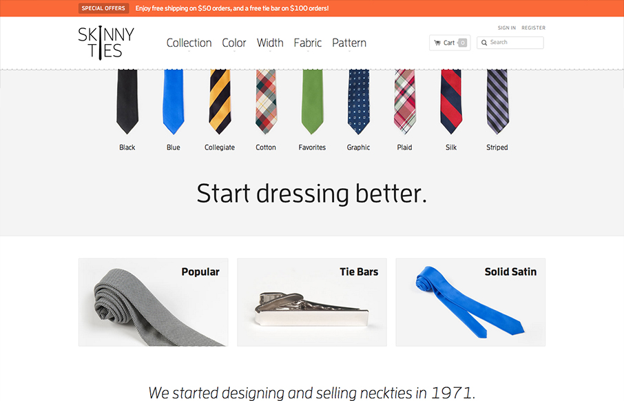
by Gene Crawford | Jan 3, 2013 | Gallery, Shopping
There’s so much to like with this site design! The layout is nice and clean and so well organized. Then the interactions steal the day with the little bobbing the ties do and the drop down design on the main nav. Then, it’s a responsive design to boot!...
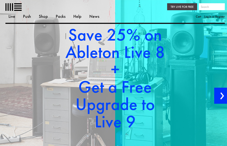
by Gene Crawford | Jan 2, 2013 | Gallery, Music, Software
The product looks pretty awesome and so the website has to continue that same visual brand. Start black and angular type, minimal colors and crisp lines when there are any mark both the physical product and website. I like the way the slideshow loads when you first...
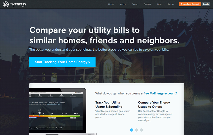
by Gene Crawford | Jan 2, 2013 | Environment, Gallery
Nice clean and strong call to action with the big blue “start tracking” button. I also dig how the header stays fixed and the slideshow is part of main content section – nice way to pack in more relevant stuff there.
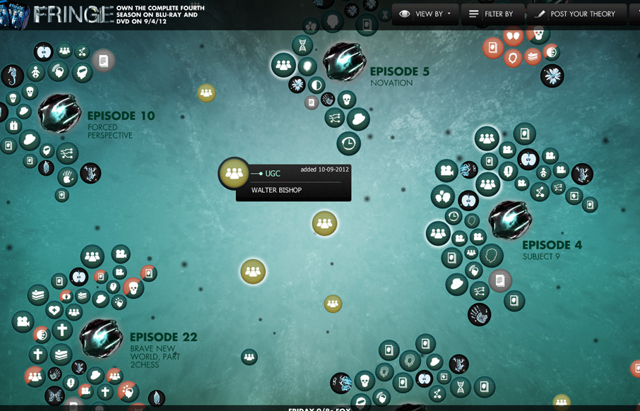
by Giovanni DiFeterici | Jan 2, 2013 | Entertainment, Gallery
This is a super cool experiment in interactive exploration. It’s not entirely practical but it’s stuff like this that keeps us pushing what we think of as a typical website interaction and we always need that. It seems a bit outdated technically –...