by Gene Crawford | Feb 28, 2014 | Design Firm, Gallery
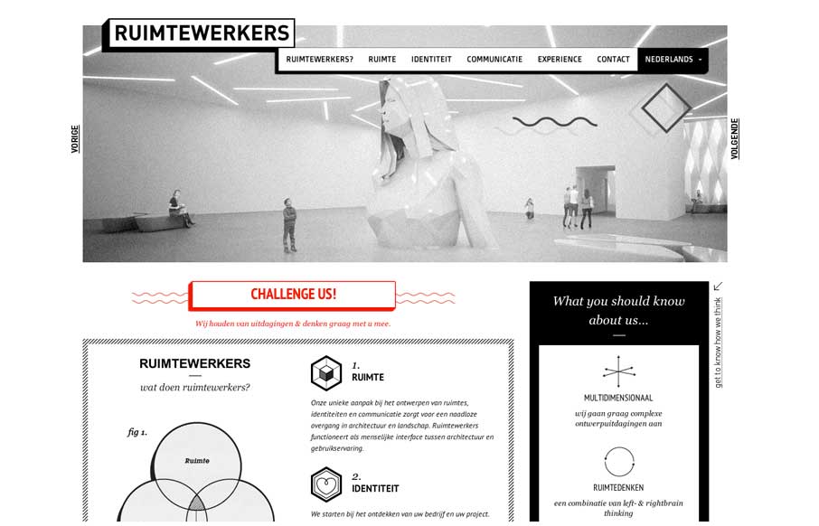
I like the stark black and white box design of this website. Very simple and clean yet it almost feels gritty due to the way the boxes are used. That fixed nav section is pretty slick. I like how it just folds down to “nav” for mobile screen widths...
by Gene Crawford | Feb 28, 2014 | Gallery, Portfolio
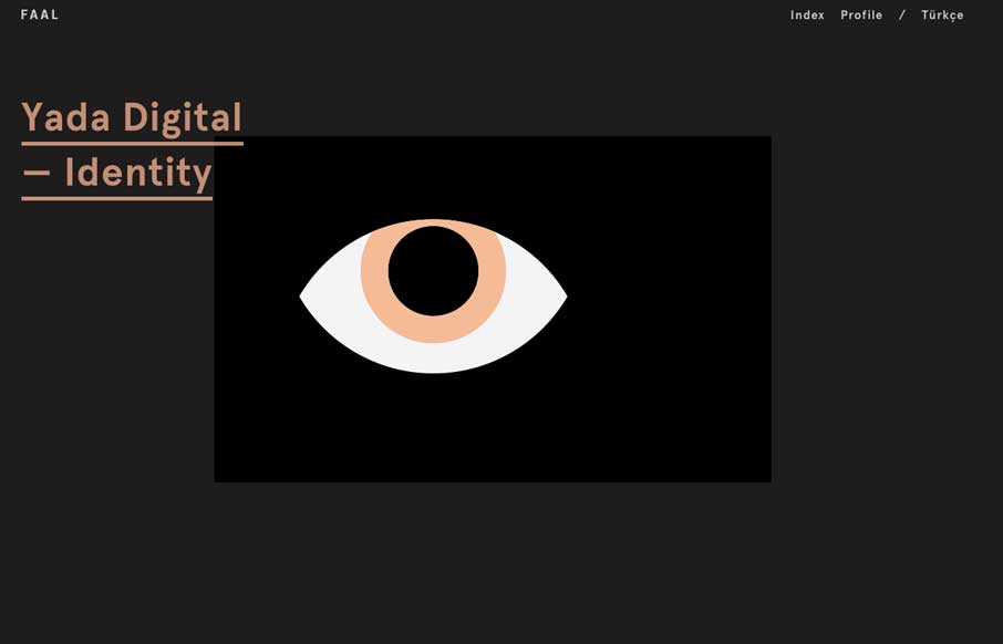
Very nice portfolio site. I really dig the dark design and the simple way the title of the work is presented overly large like that. Very cool.
by Gene Crawford | Feb 28, 2014 | Gallery
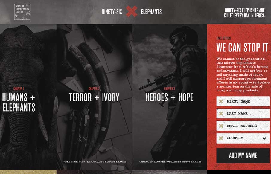
Beautiful website for a good cause. I really like how the petition slide-out menu works, kind of following you down the page as you scroll end bouncing out when you click. Beautiful photography too. Sign it and maybe save an elephant man!

by Gene Crawford | Feb 27, 2014 | Education, Gallery
Really nice Responsive design solution for a major university website. The website is so huge (like most Univ. sites are) that i’m not going to go into any subpage stuff. The main thing I want to point out is the way the navigation is worked into the hero area...
by Gene Crawford | Feb 27, 2014 | Gallery
I really like the overall simplicity in this design. It get’s you to the point really really fast. I think it boarders on being too subtle at times, but that’s not always a bad thing 🙂 I love the visual rhythm in the work page the most. They could keep...