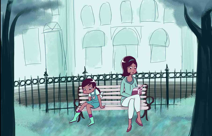
by Gene Crawford | Mar 27, 2014 | Gallery
A very intriguing site by Rachel Nabors, an interactive telling of the Alice in Wonderland story. You’d better just take a look and see what you think for yourself. An interactive take on Lewis Carroll’s classic tale, lovingly crafted in HTML5, CSS3, and...
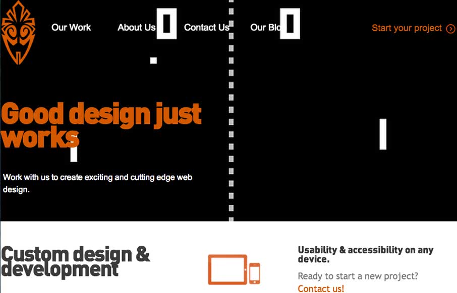
by Gene Crawford | Mar 27, 2014 | Gallery
Overall the layout of 3 One Seven is intense visually. There’s blocks of imagery competing for your attention – which as I review this site appears to be the point of the design. It’s successful in that the images are actually compelling visually and...
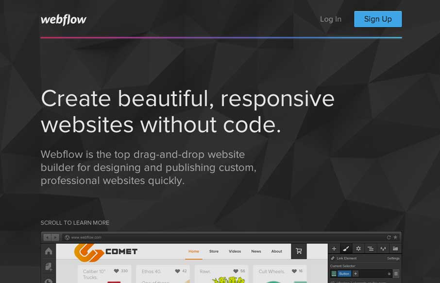
by Gene Crawford | Mar 26, 2014 | Gallery
Pretty much a flat organized page here with the Webflow site. It works well in this case, considering their audience. I love how the main featured image fades out as you slide down the page. The signup form all lined up horizontally looks very quick to get through...

by Gene Crawford | Mar 26, 2014 | Gallery
I like the way the main featured content area on this website is utilized. There’s a nice block of well written copy and their featured departments near it. I also like how “main menu” is displayed when you scale the page down to mobile widths. Very...
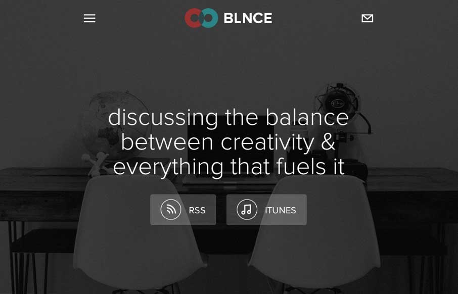
by Gene Crawford | Mar 26, 2014 | Gallery
Really nice simple layout for this podcast series. There’s been a swath of podcasts being created the past few years and as a result we get to see lots of different looks at how people handle the site designs. This one is one of my favorite designs.