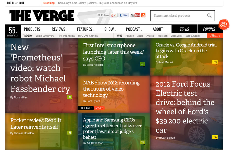
by Gene Crawford | Apr 18, 2012 | Blog, Gallery
The Verge isn’t exactly new news in the design world. It’s been around a few months. I happen to feel like it’s a great experience in terms of taking in news/stories, both on the old laptop and on my iPad too. What are your gripes or loves for...
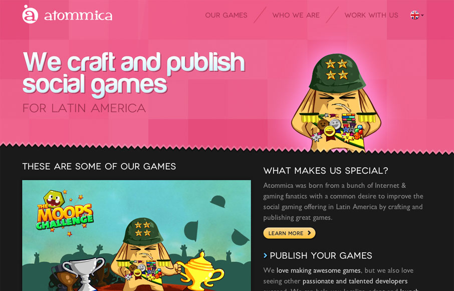
by Gene Crawford | Apr 17, 2012 | Gallery
Pretty tight design that allows itself to feel lose at the same time. The illustrations are what helps it achieve that. Simple mouse over animations here and there keep it interesting. Follow all that up with a nice responsive layout and you have yourself a damn fine...
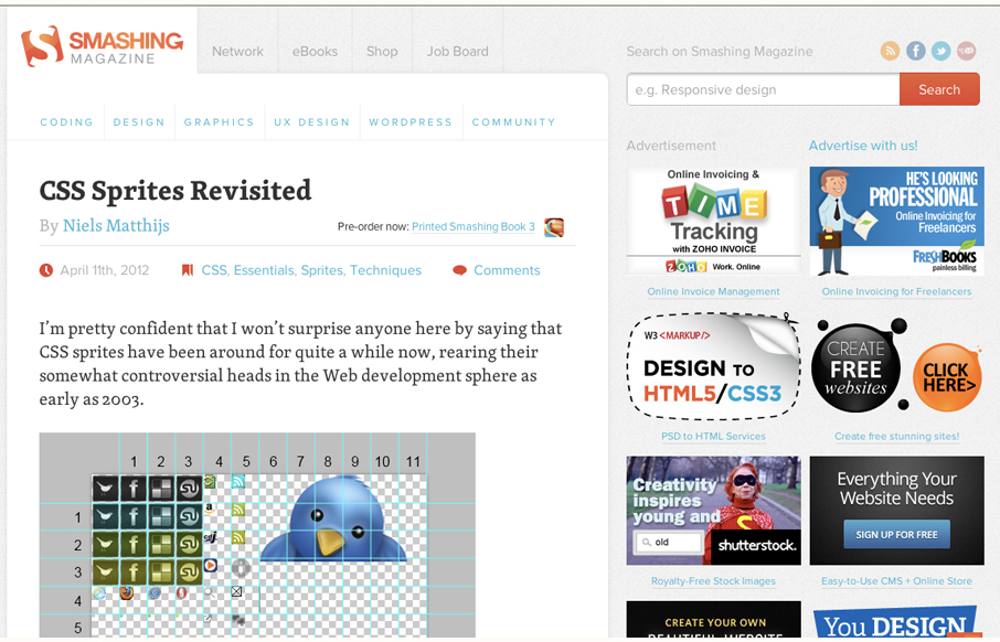
by Gene Crawford | Apr 13, 2012 | Blog, Gallery
Smashing Magazine is one of those industry staple websites right? Like Facebook, you mess with it people either love it or hate it. Giovanni and I explore the responsive design decisions in some detail (kinda) in our screen cast review. Overall we do really dig the...
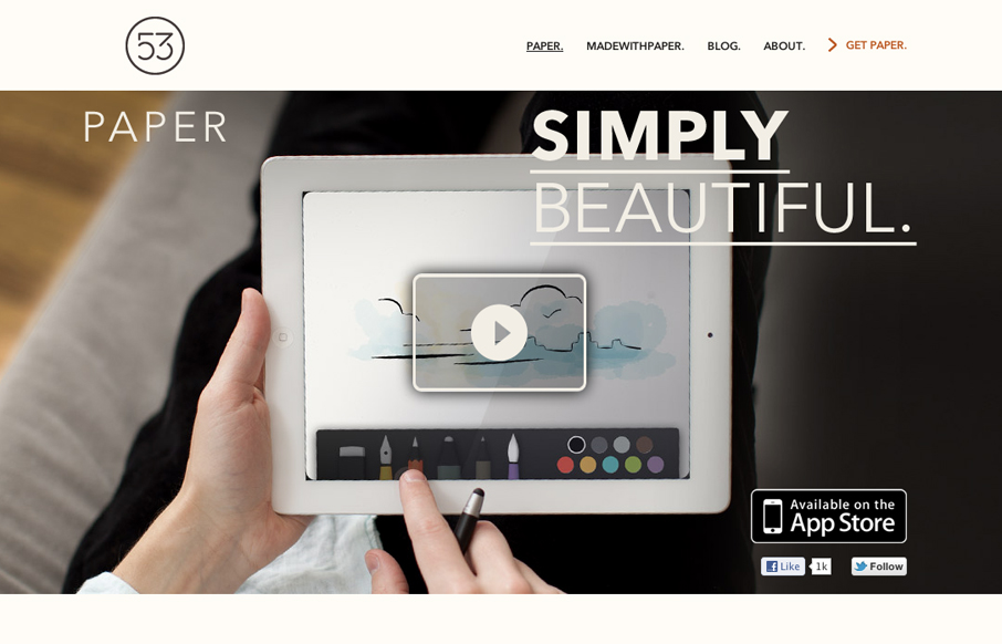
by Gene Crawford | Apr 12, 2012 | Gallery
The Paper app home page is actually a sub page of the FiftyThree website. It’s gorgeously clean and simple though. I absolutely love how the images and copy flow down the page being strongly gridded out but yet almost asymmetrical at the same time.
by Gene Crawford | Apr 12, 2012 | Design Firm, Gallery
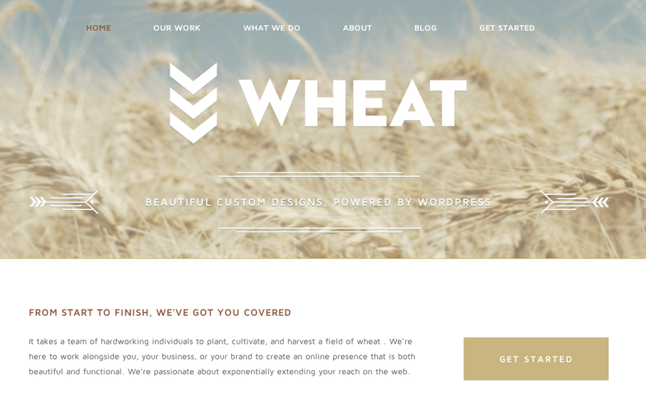
Just a beautiful design, simple as that. I love the big bold image of the wheat and the large WHEAT set on top of it. Subtle yet not at all. The rest of the site is a display of restraint by the designer, which shows maturity to me. Love it.